
CLIENT & PROJECT OVERVIEW
Client: FutureFunds
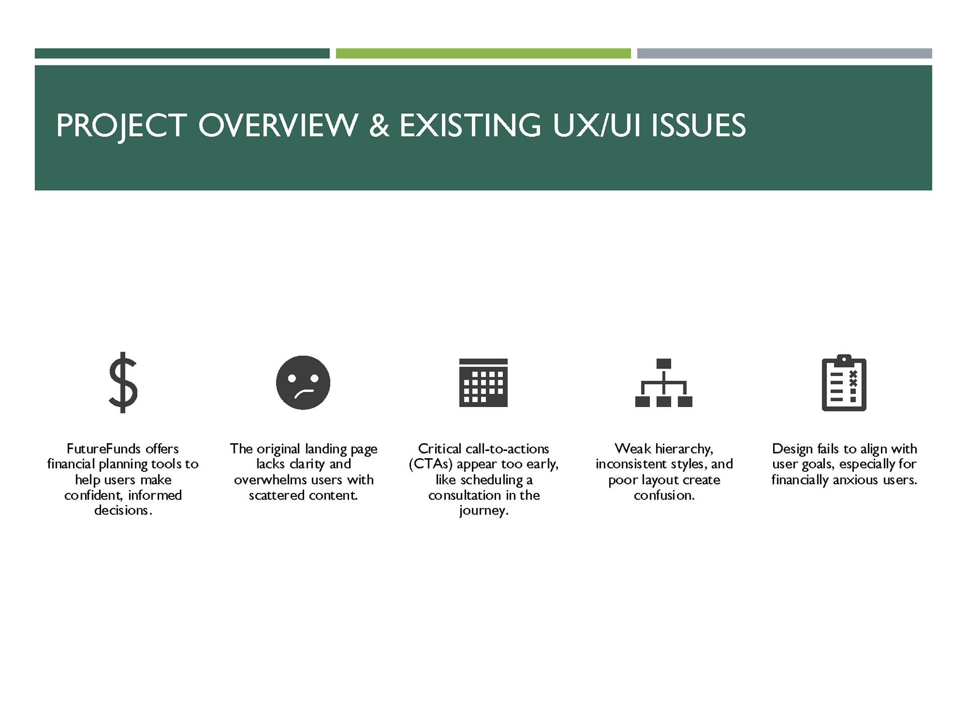
FutureFunds Financial Planning, founded in the early 2000s, is dedicated to helping young professionals achieve financial success and security. Their mission is to provide tools, services, and guidance for informed decision-making that shapes a stable financial future.
To better engage a younger audience, FutureFunds sought to revamp its online presence by introducing a modern landing page designed to:
• Increase engagement with educational resources and tools.
• Convert visitors into clients through a structured lead generation process.
• Showcase brand credibility through clear communication and trust-building elements.
Client Objectives
FutureFunds sought a modern, user-friendly landing page that would serve as a lead generator while showcasing their expertise. Along with introducing the company to potential clients, the landing page needed to include these requested features:
• Service Offerings: Clear, concise display of services.
• Financial Calculator: An interactive tool for estimating investment returns.
• Appointment Scheduler: A simple way to schedule consultations.
• Recent Blog Posts: To share educational content and boost engagement.
• Testimonials: Social proof to build credibility.
Role: Lead UX/UI Designer
Timeline: 8 weeks
Key Deliverables:
• High-fidelity desktop and mobile mockups
• Usability testing plan
• PowerPoint Presentation
Programs used:
Adobe Photoshop / XD, Figma, PowerPoint, WCAG 2.1 Guidelines
THE PROBLEM
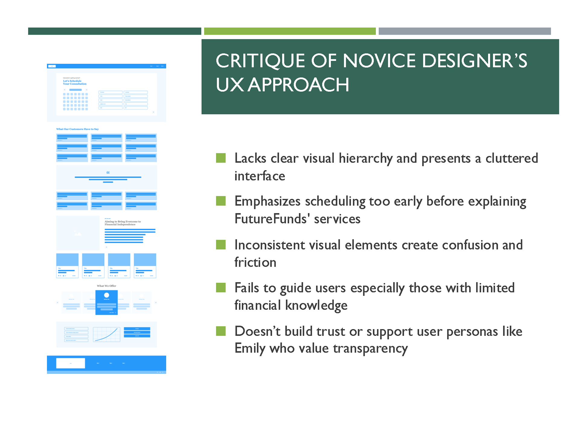
The original landing page and novice wireframe lacked clarity and user focus:
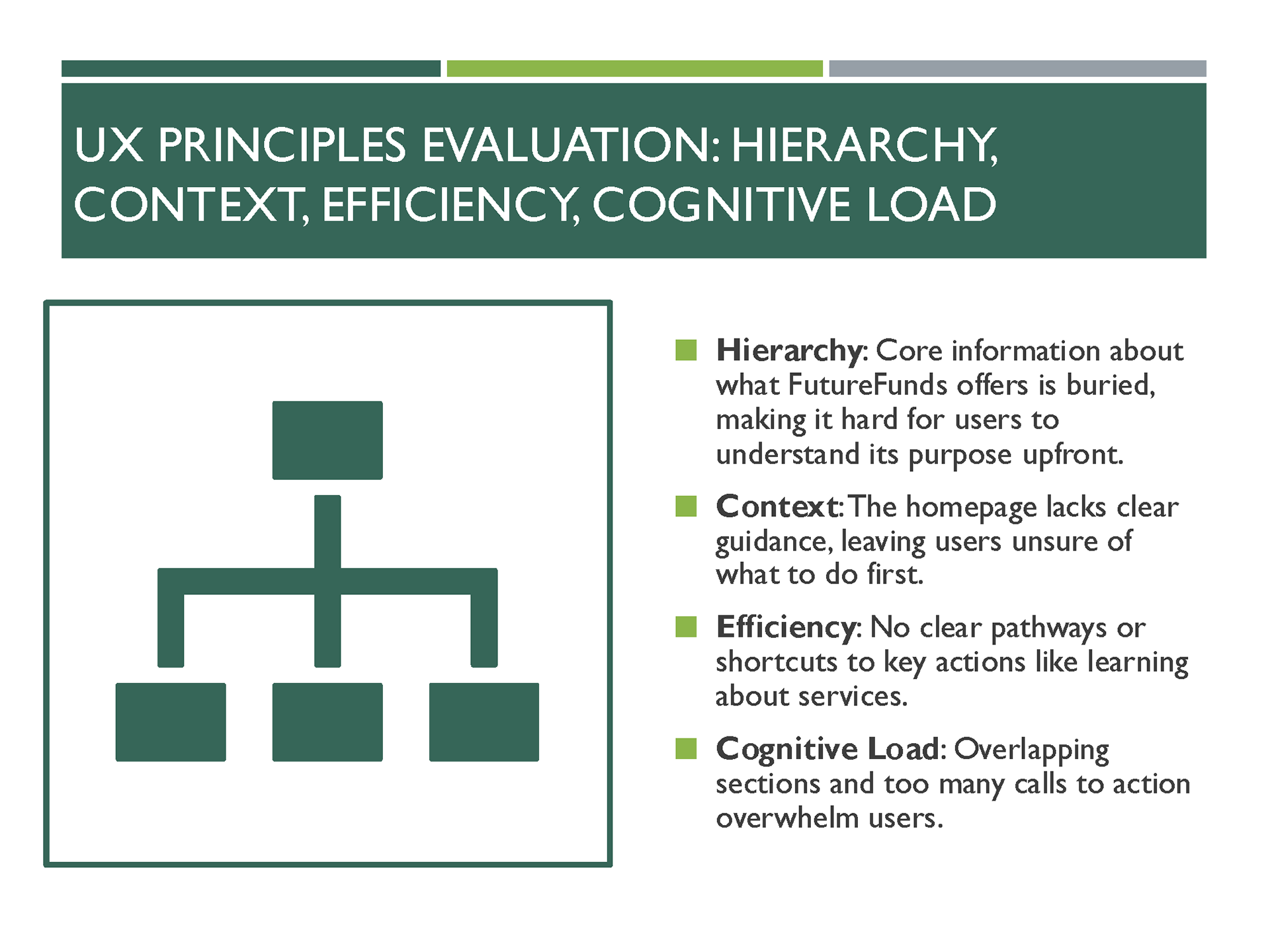
• Overwhelming Layout: Too many elements crammed together with little spacing.
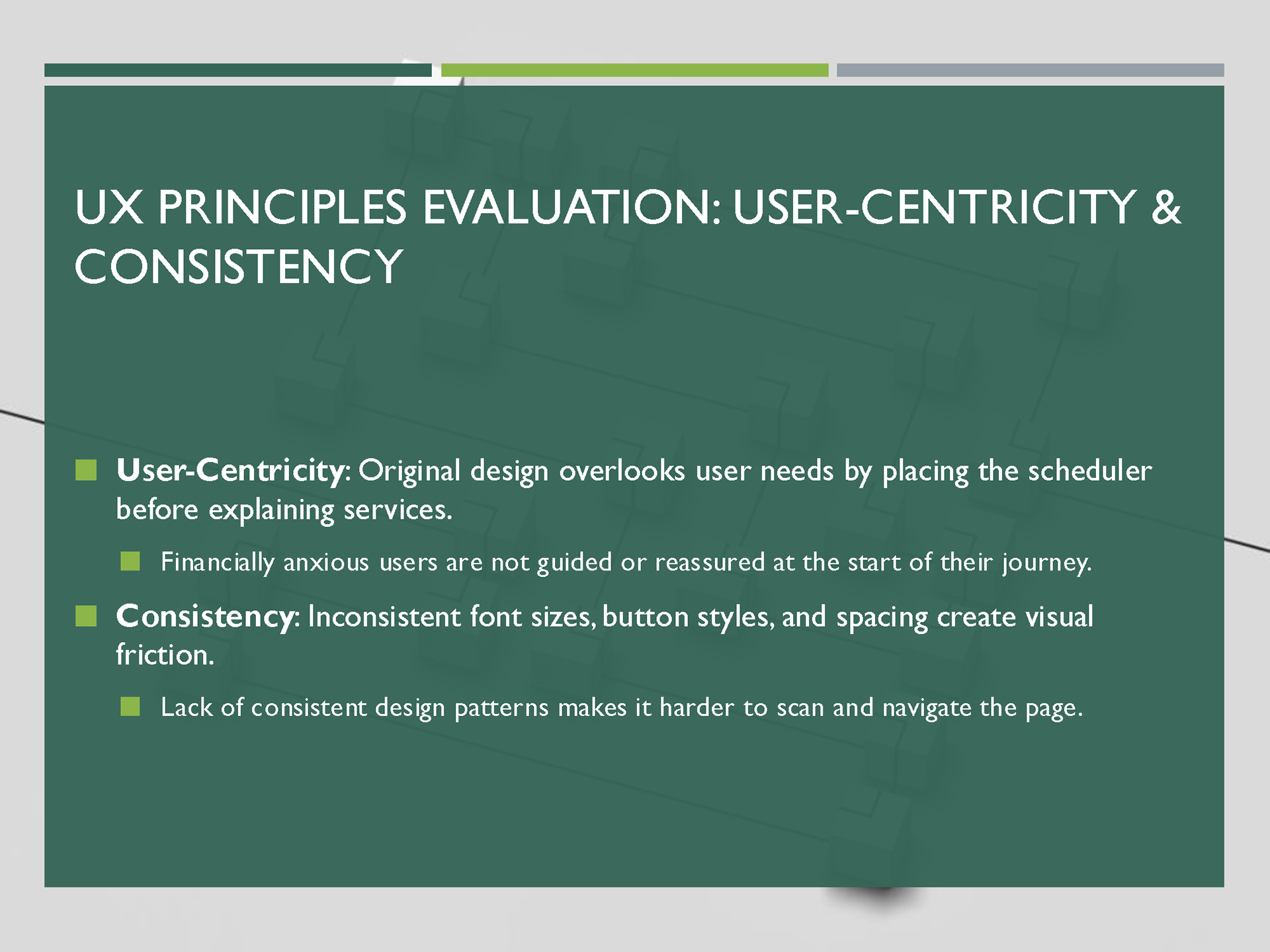
• Misplaced Priorities: Appointment scheduler and testimonials appeared before company and service information.
• Navigation Confusion: Buttons without labels and inconsistent iconography caused usability issues.
• Long, Intimidating Forms: Users questioned why personal details (such as full address) were required upfront.
• No Clear Conversion Path: Users were unsure where to click to learn about the services.
These issues created friction, reducing trust and engagement for a financial services platform where credibility is crucial.
RESEARCH AND INSIGHTS
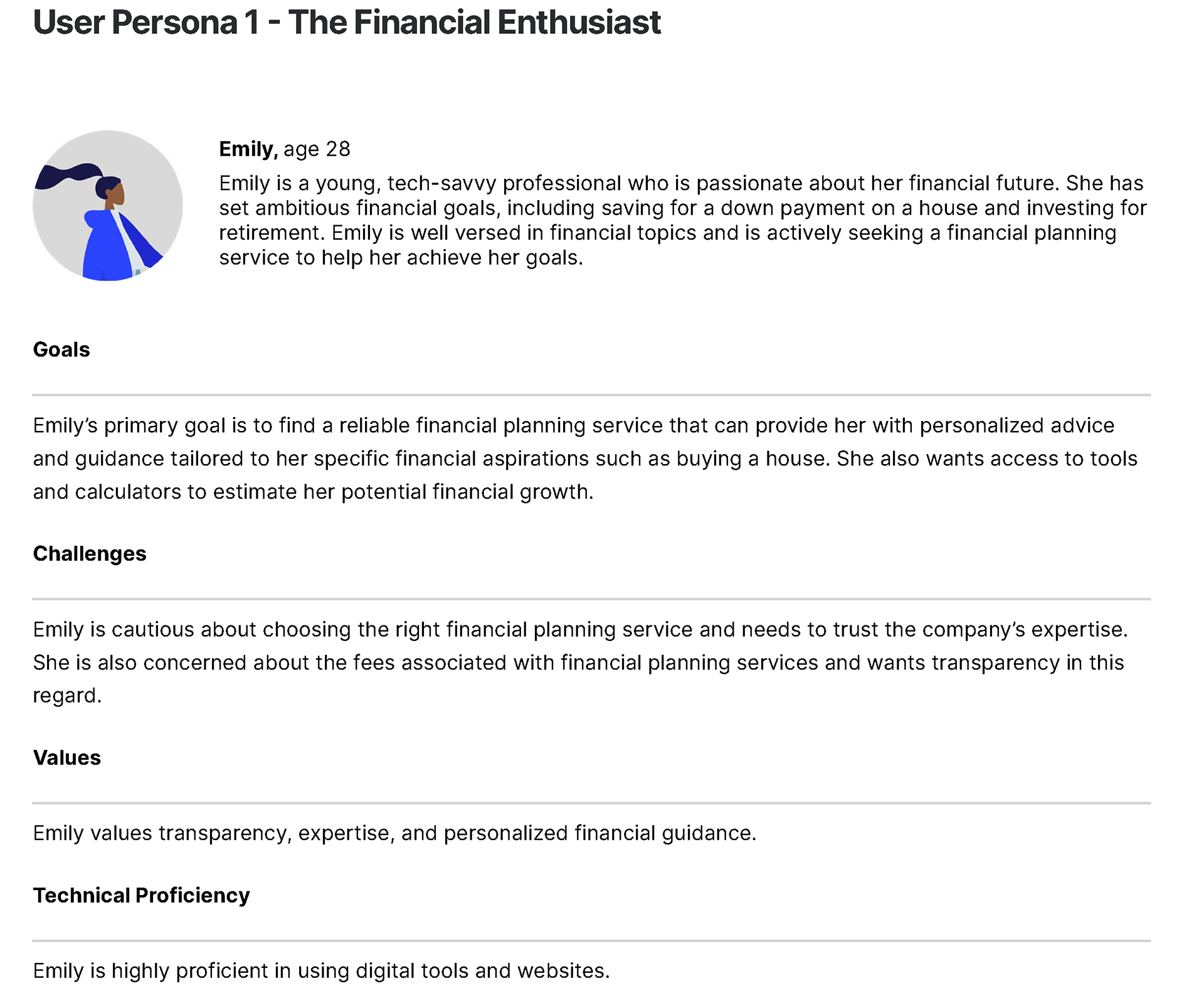
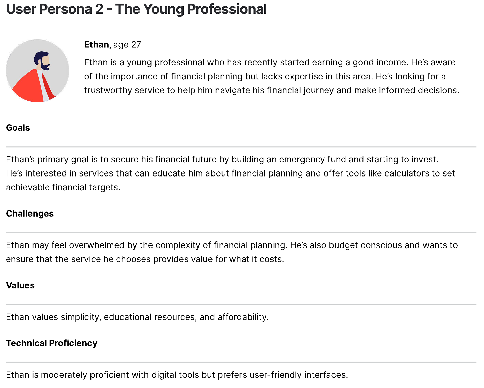
User Personas
Three core personas shaped the design strategy:
• Emily (28) – Financial Enthusiast: Wants personalized advice and tools for long-term growth.
• Ethan (27) – Young Professional: Needs simplicity and education to start financial planning.
• Raj (29) – Financial Recoverer: Focused on debt reduction and empathetic guidance.
Shared Needs: Clarity, trustworthiness, and easy-to-use features.
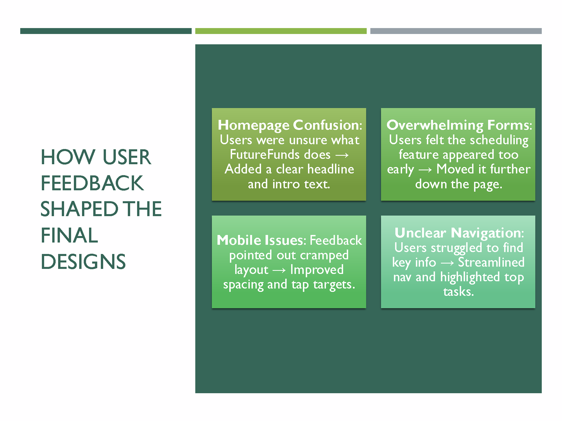
Wireframe Review & Feedback Analysis
Before creating high-fidelity designs, I assessed the novice designer’s wireframe to identify potential usability issues through user interviews and heuristic evaluation.
Key Issues Identified:
• Cluttered Layout: Users felt overwhelmed, noting “there was no space between any of the items”.
• Confusing Content Hierarchy: The Appointment scheduler appeared at the top, leading users to question the company’s purpose before learning about its services.
• Unclear Navigation: Buttons lacked descriptive labels, and arrow icons were confusing to users.
• Overloaded Forms: The consultation form requested unnecessary details (e.g., full address), creating friction and user stress.
• Misplaced Testimonials: Reviews appeared before service information, breaking logical flow.
• Ambiguous Cards: Users were unsure what the cards under “Who We Are” represented—blog posts, services, or news.
User Quotes:
“I couldn’t grasp what the company was about before being prompted to schedule an appointment.”
“The form is excessively long. I got overwhelmed.”
“Most buttons lacked labels—I didn’t know what they were meant for.”
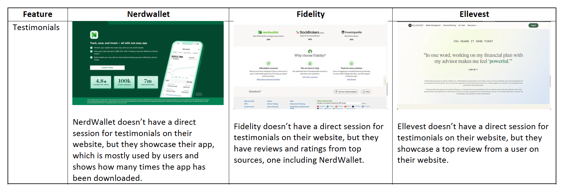
Competitive Analysis
Studied NerdWallet, Fidelity, and Ellevest to identify best practices:
• Service Listings: All competitors clearly showcased their services at the top.
• Financial Calculators: Common across NerdWallet and Fidelity; Ellevest lacked one.
• Appointment Scheduling: Rare, except for Ellevest, which offered a simple scheduler.
• Blogs: All competitors featured educational blogs to build engagement.
• Testimonials: Not heavily prioritized by competitors, reinforcing the need for subtle placement.
Insight: FutureFunds required a landing page that combines the clarity of service listings, interactive tools, and balanced trust elements, while avoiding the shortcomings of competitors.
THE SOLUTION
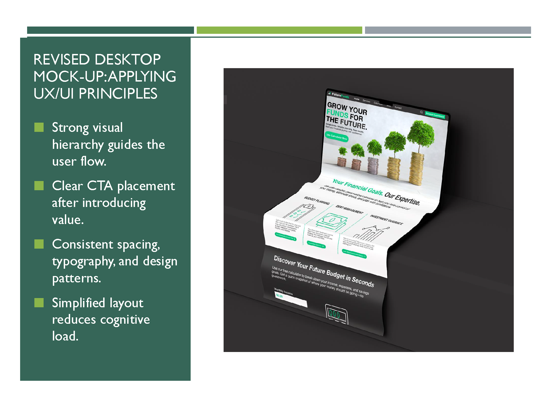
Designed a responsive, modern landing page with a user-focused structure:
• Clear visual hierarchy and logical flow.
• Simplified appointment process.
• Consistent navigation with labeled buttons.
• Accessibility compliance for inclusivity.
DESIGN PROCESS
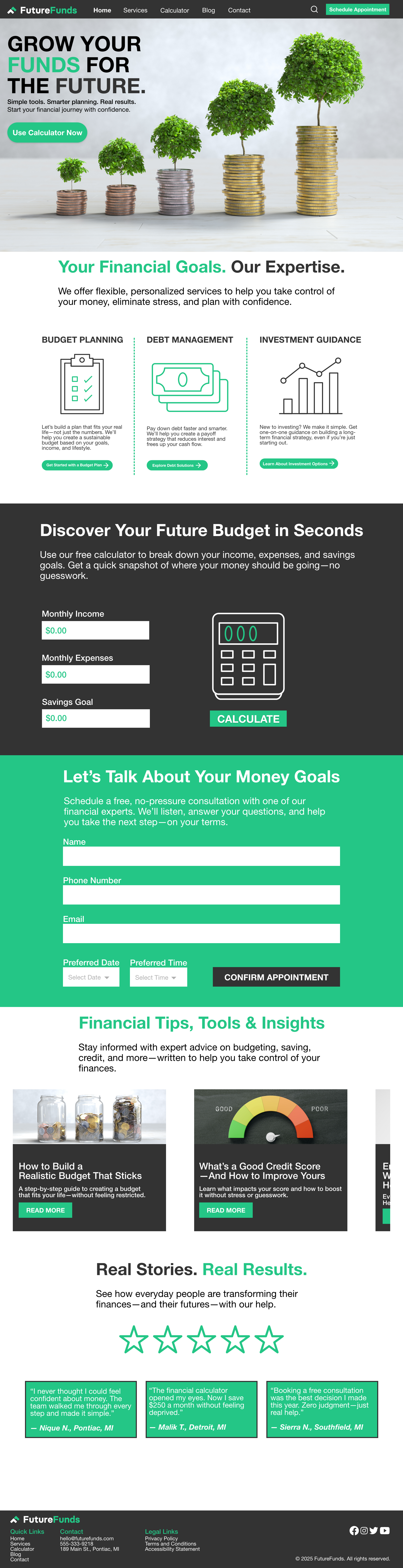
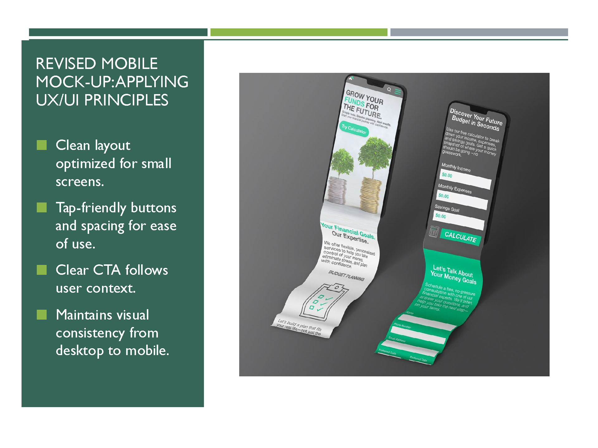
1. Restructuring the Layout
• Created a clear IA: Hero → Services → Calculator → Scheduler → Blog → Testimonials.
• Reduced cognitive load by spacing content and simplifying visual grouping.
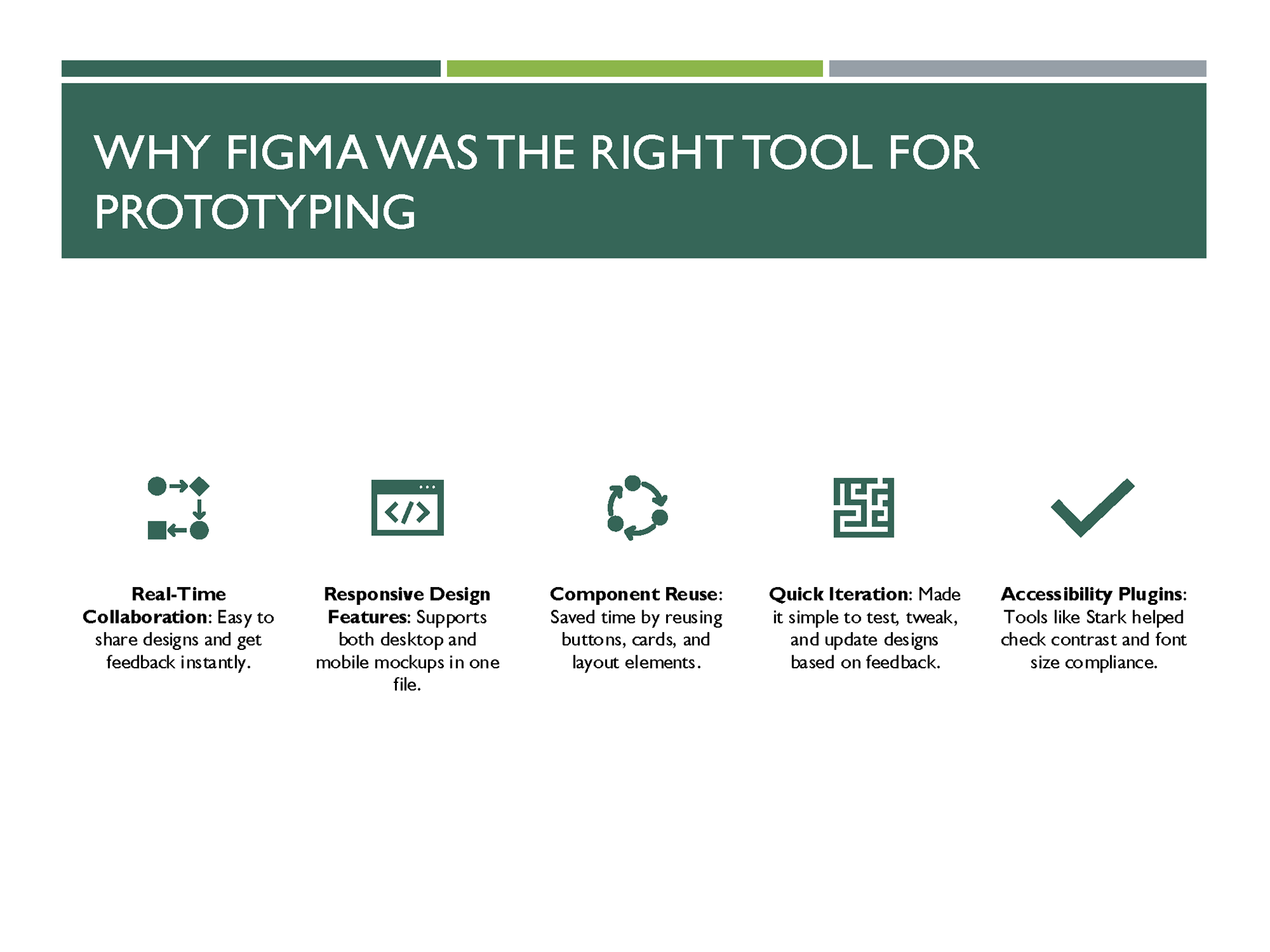
2. High-Fidelity Mockups
Developed responsive mockups in Figma:
• Visual Design:
• Brand colors (#23C686 green, #333333 gray).
• Clean typography for readability.
• UI Enhancements:
• Interactive calculator with contrasting section background.
• Streamlined appointment form.
• Blog previews and testimonials are displayed with ample spacing.
• Consistency: Ensured alignment across desktop and mobile layouts.
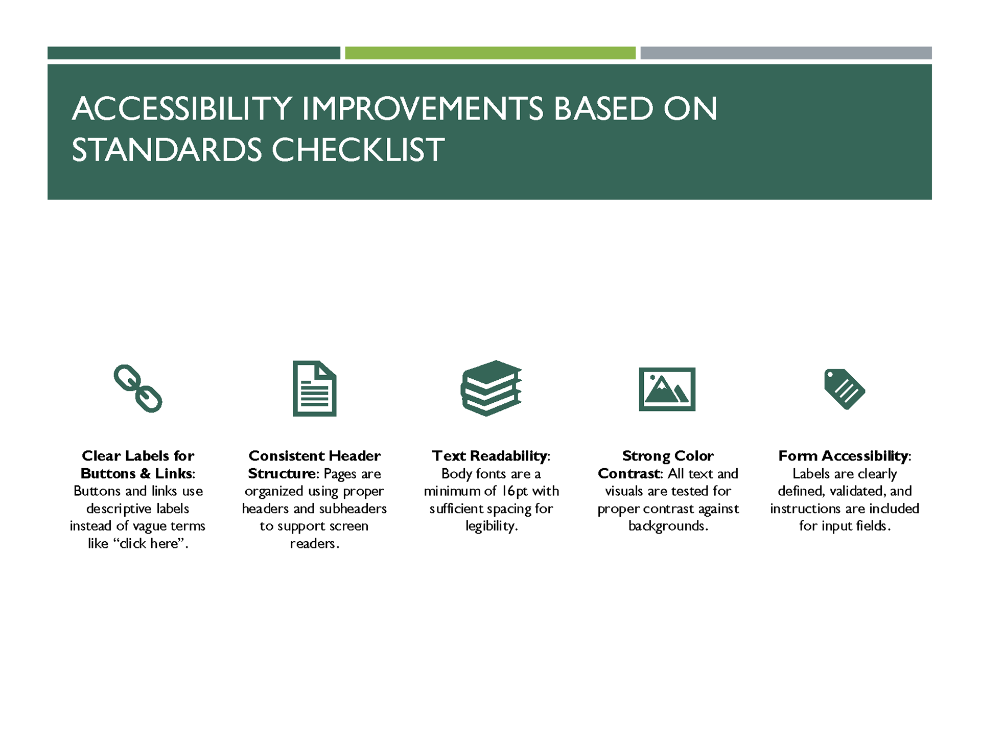
3. Accessibility
• WCAG 2.1 AA compliance for color contrast and text scaling.
• Designed keyboard-friendly interactions for forms and navigation.
4. Competitive Insights Applied
• Services prioritized for quick scanning.
• Calculator added for value-driven engagement.
• Scheduler retained as a differentiator for FutureFunds.
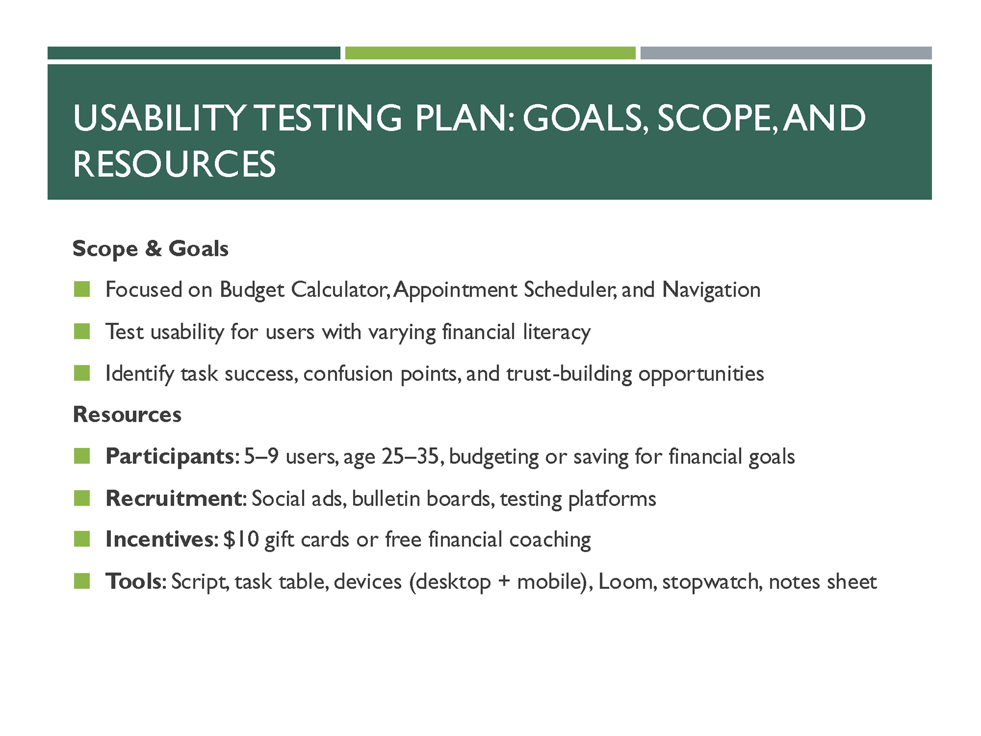
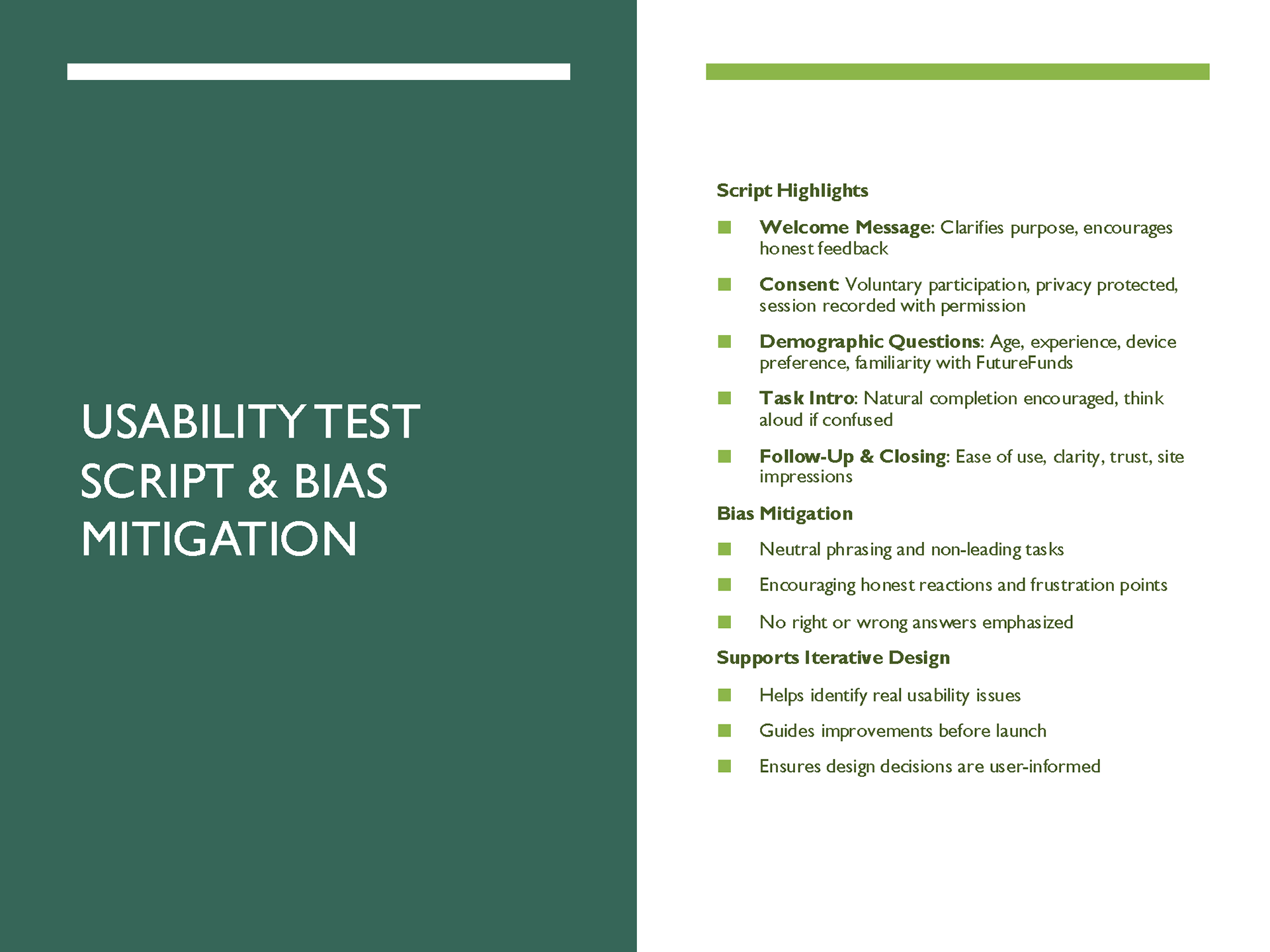
5. Usability Testing Plan
Scope focused on key interactions and trust-building:
• Goals: Validate navigation clarity, ease of using tools, and user confidence.
• Participants: 5–9 users aged 25–35 with varying financial literacy.
Tasks:
• Use the calculator (under 1 min).
• Schedule an appointment (under 90 sec).
• Navigate to Services (under 30 sec).
• Find a blog post on credit scores (under 45 sec).
Follow-Up Questions: Assessed ease of use and perceived trustworthiness.

DESIGN PROCESS
Before vs After
• Before: Overcrowded, no precise CTA flow, inconsistent navigation.
• After: Structured design guiding users from awareness → engagement → conversion.
Key Features Implemented
• Hero section with CTA.
• Service offerings grid with clear labels.
• Interactive financial calculator.
• Streamlined appointment scheduler.
• Blog section for ongoing education.
• Testimonials for trust without clutter.
Impact
• Improved clarity and reduced cognitive load.
• Increased discoverability of core features (calculator, scheduler).
• Delivered an accessible, responsive design aligned with brand goals.
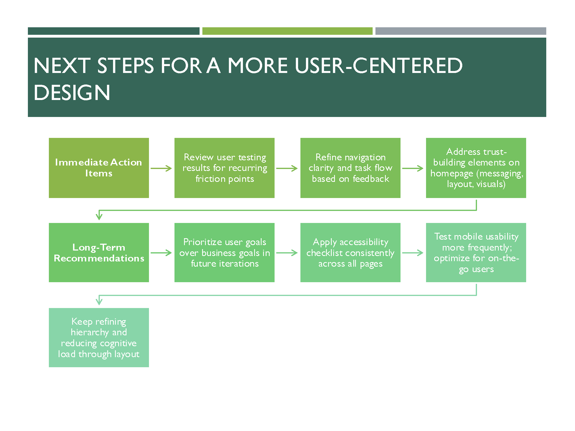
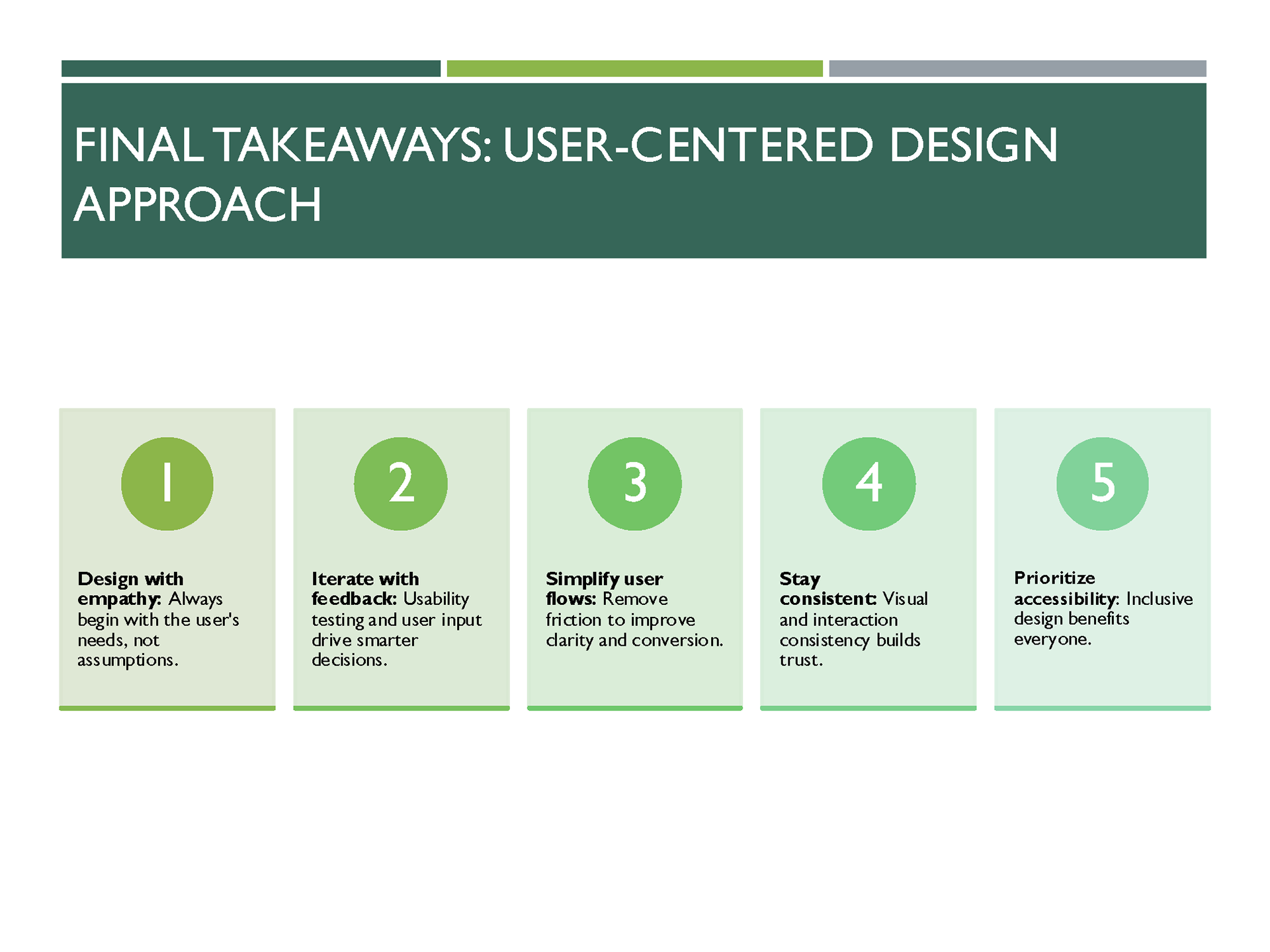
Takeaways
• Early feedback is essential for fixing hierarchy and trust-building gaps.
• Accessibility benefits everyone and strengthens credibility.
• A structured flow ensures that user needs and business goals align for maximum engagement.
✅ Next Steps
• Conduct usability testing with real users.
• Implement micro-interactions (hover states, error feedback).
• Prepare for developer handoff.
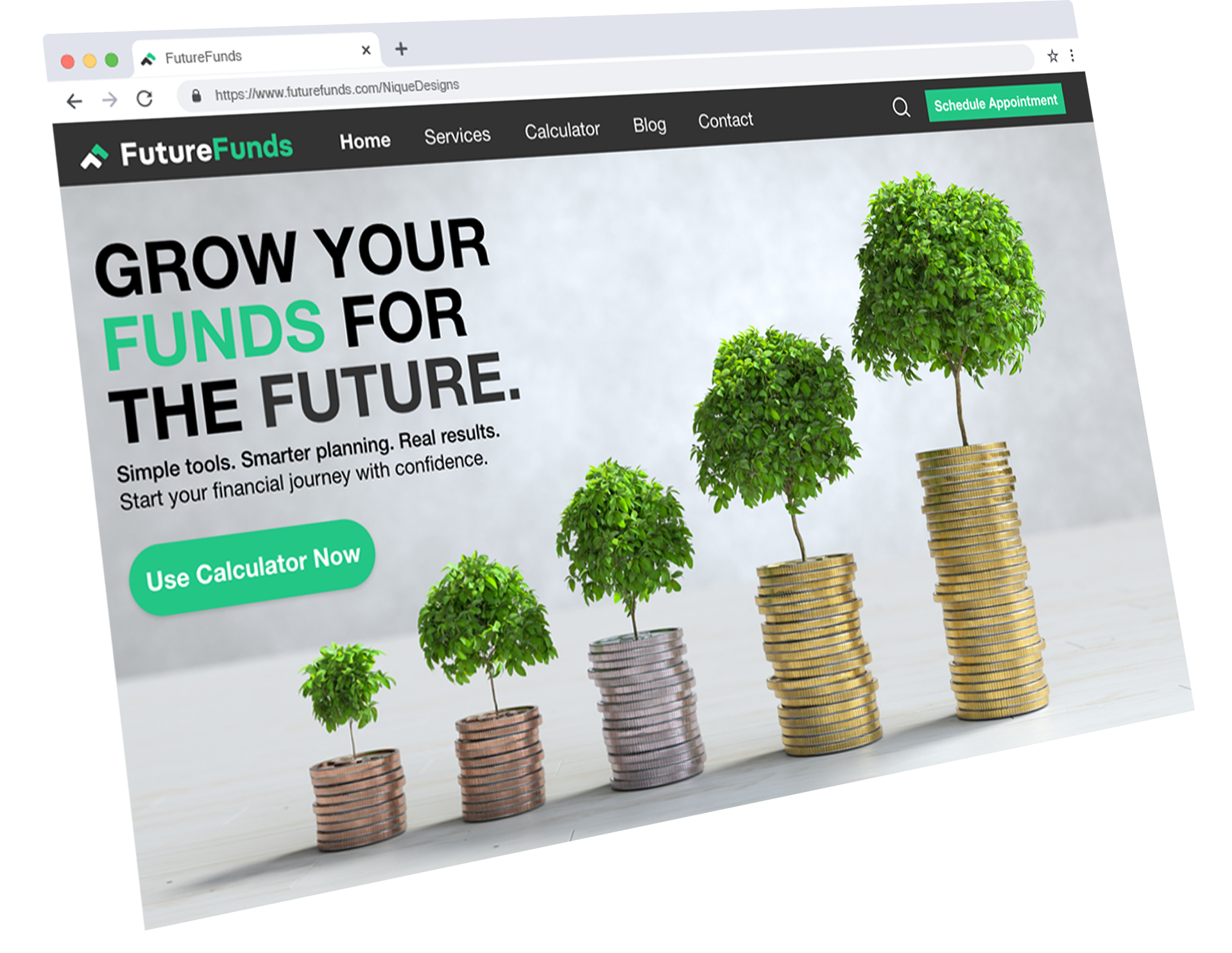
FutureFunds Browser
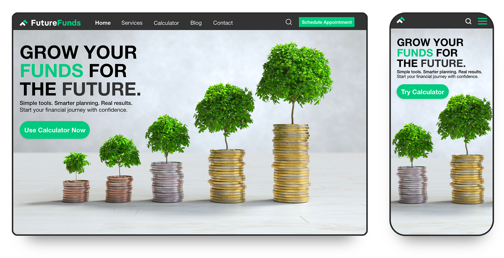
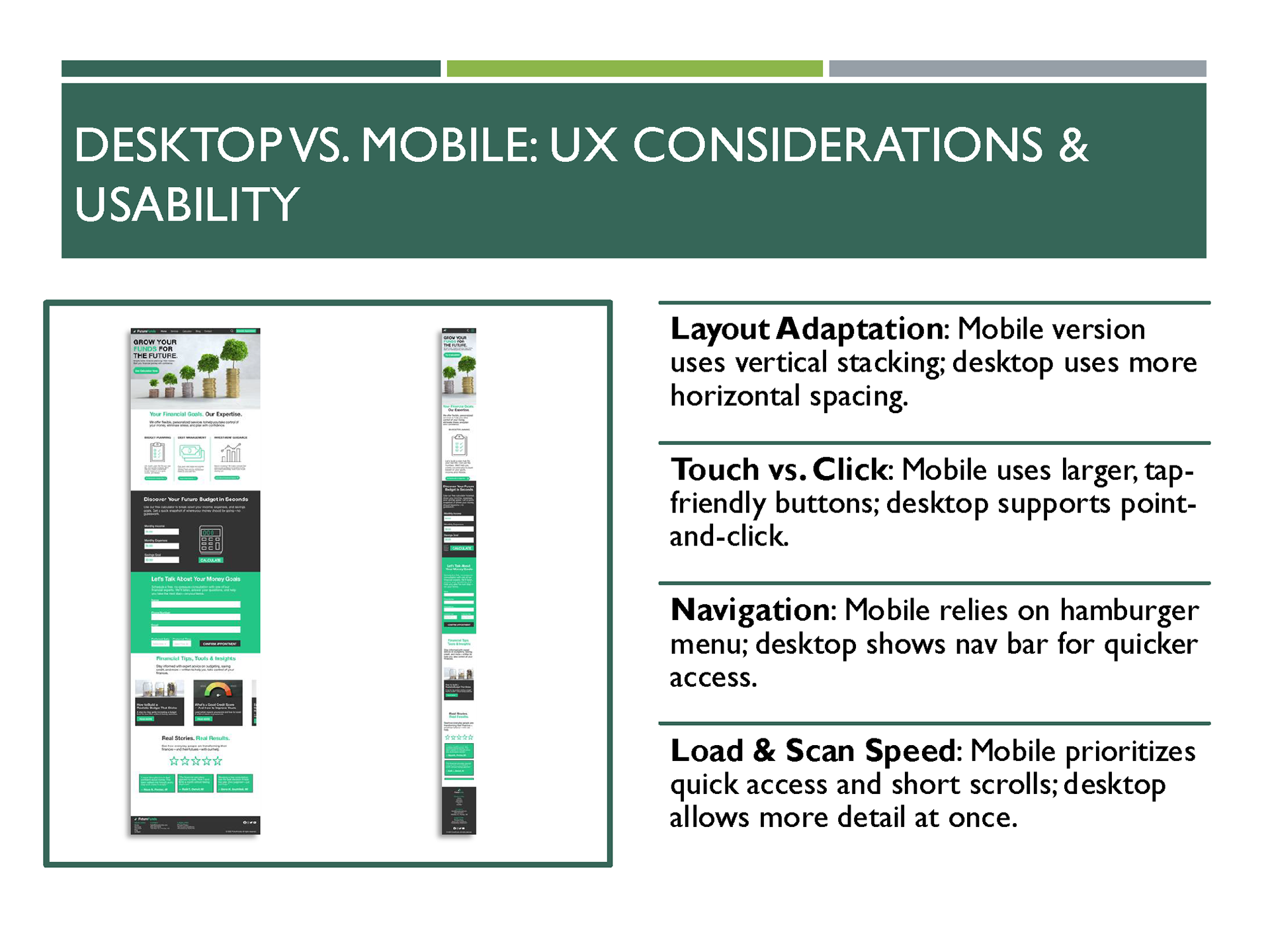
FutureFunds Desktop and Mobile Mockups
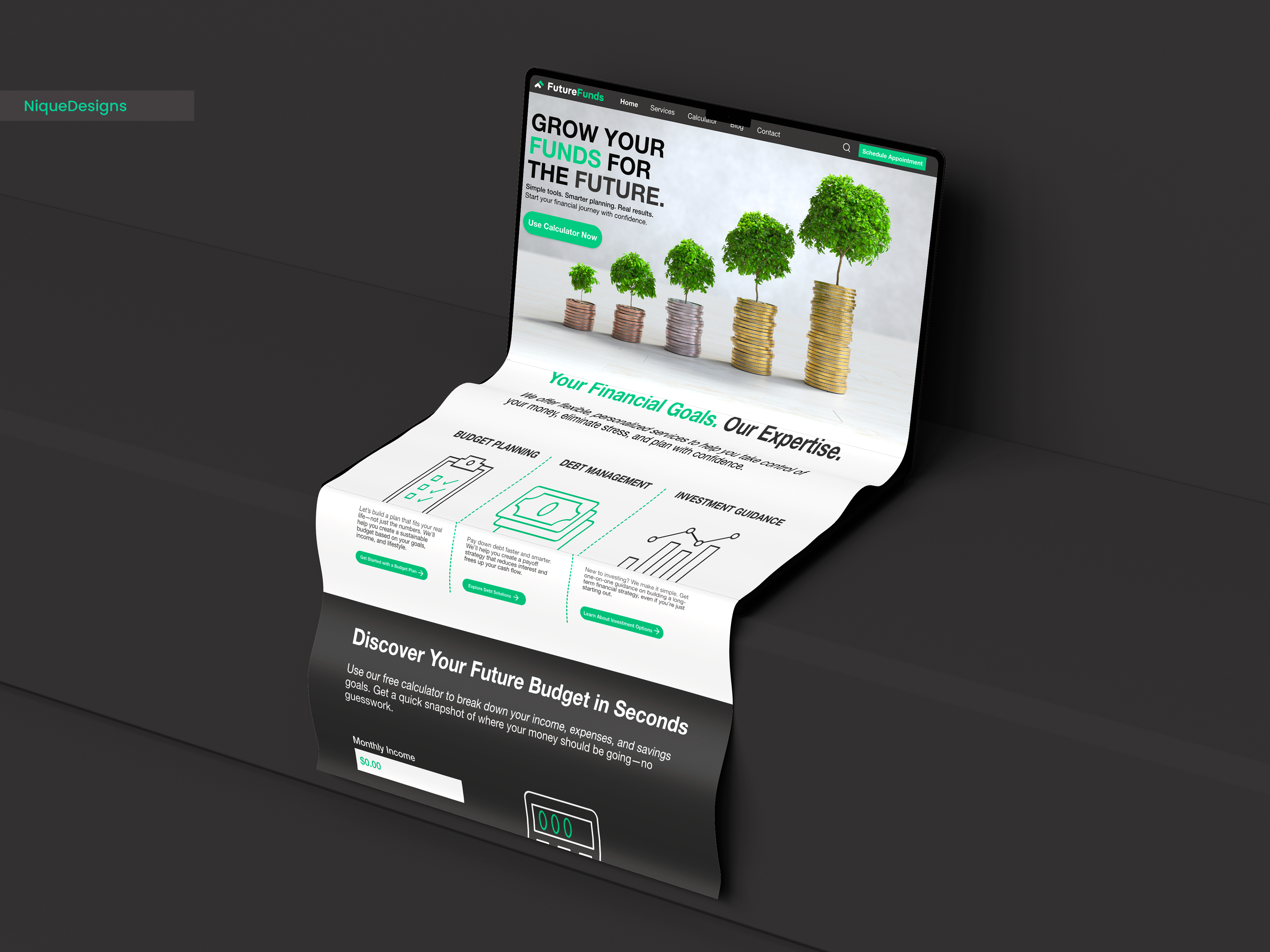
FutureFunds Desktop Long Scroll
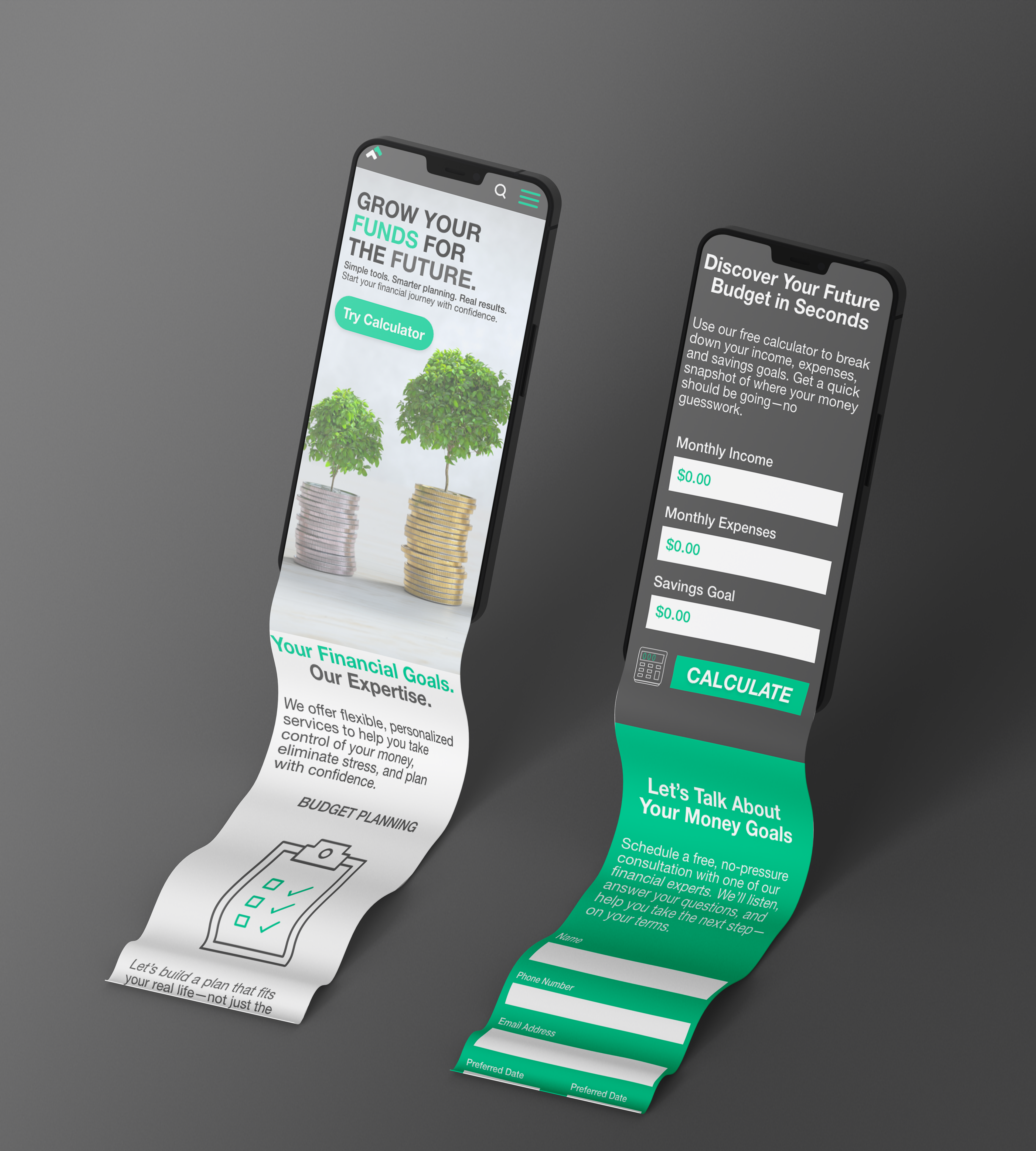
FutureFunds Mobile Long Scroll
POWERPOINT PRESENTATION

Fund Your Future 📈💰