OVERVIEW
Purpose: An internal employee portal for Stellantis employees to access essential employment-related information.
Features:
• Easy access to attendance, hours worked, pay statements, benefits, and other critical details.
• A user-friendly, intuitive interface with streamlined navigation for quick and efficient information retrieval.
• High security to protect and ensure the confidentiality of employee data.
Goal: Simplify the process of accessing employment information, providing a convenient and accessible solution to enhance employee satisfaction and support.
ROLE
UX/UI Designer
• Conducted user research to identify needs and pain points.
• Created wireframes to plan the app's structure.
• Developed prototypes to visualize the user flow.
• Focused on interaction design for seamless navigation.
• Led visual design to ensure the app was functional and aesthetically pleasing.
• Conducted testing to gather feedback and refine the design for optimal usability.
Programs used:
Illustrator, Photoshop, XD
Note: This case study represents an independently designed UX concept created before the official HUB app launch in November 2025. While the final product differs from this concept, this project highlights my design process, problem-solving approach, and user-centered decision-making.

THE PROBLEM
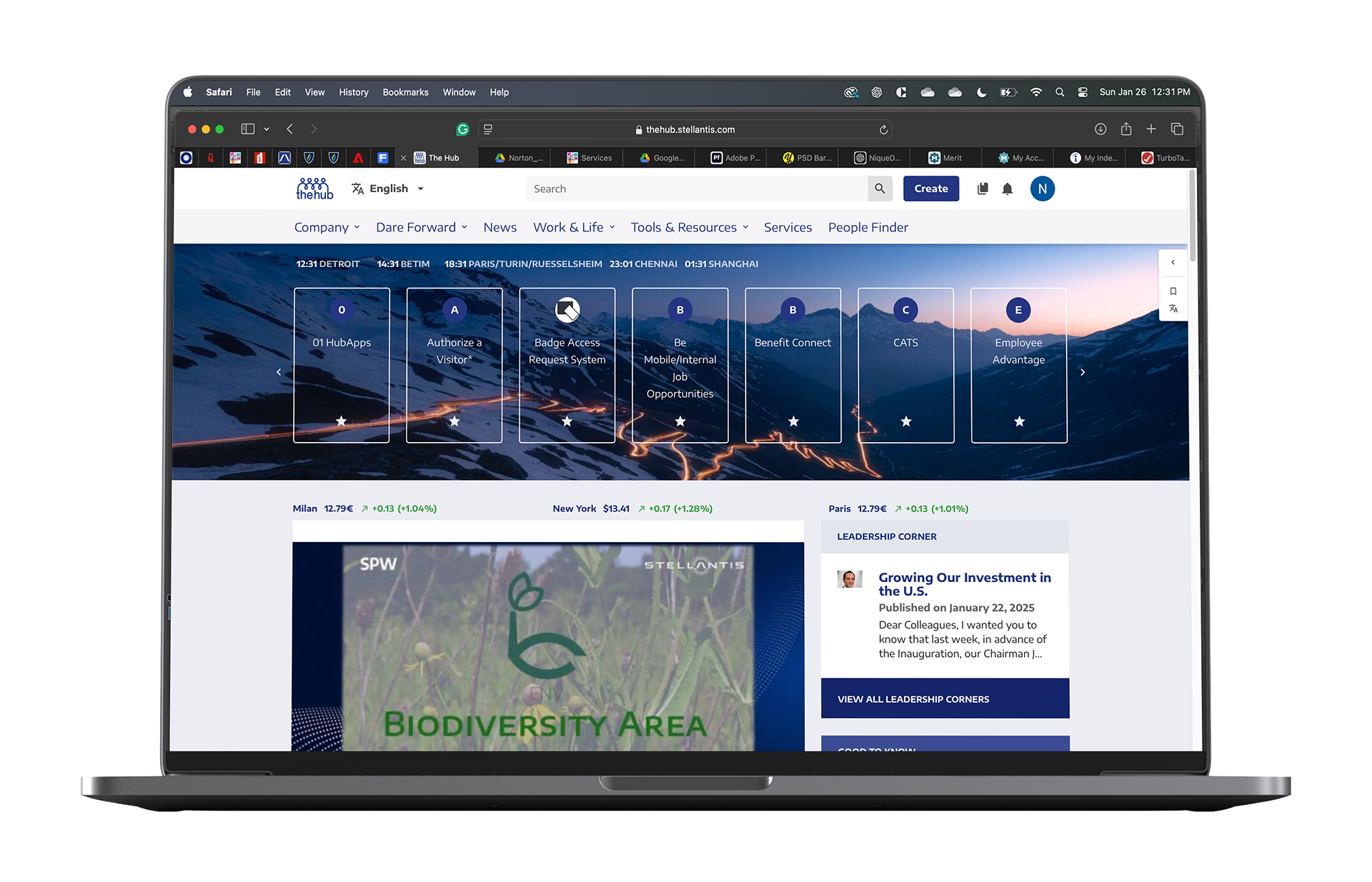
Current Platform: The Hub is a desktop-only platform that allows employees to access important information such as attendance records, pay statements, and work hours.
User Demand: Employees seek more flexible and mobile access to this information.
Challenges: The desktop-only format limits accessibility and convenience, especially for employees who are frequently on the go and need easy access to their work-related data.
THE GOAL
Objective: Design a mobile app for The Hub to provide employees with easy and convenient access to work-related information, including attendance, pay statements, and work hours.
Addressing Pain Points: The app will address the limitations and challenges of the current desktop platform, making it more accessible and user-friendly for employees on the go.
User-Centered Design: The design will focus on employees' needs and preferences, ensuring the app is intuitive and effective.
Outcome: The app aims to increase employee engagement and satisfaction, leading to a more efficient and productive workplace.
USER RESEARCH
SUMMARY:
Objective: Understand employees' needs and pain points related to attendance, hours, and pay statements.
Method: Conducted one-on-one interviews to gather insights into the current process of accessing this information.
Findings: Employees expressed a need for a more efficient, user-friendly solution to view attendance, hours, and pay statements on mobile devices.
Impact: The research informed the design of The Hub app, aiming to provide a streamlined, intuitive, and secure platform for employees to easily access this critical information.
PAIN POINTS:
PAIN POINT 1
Inadequate mobile accessibility makes it difficult for them to stay connected and informed while on the go.
PAIN POINT 2
The desktop version may be limited in functionality, preventing employees from performing essential tasks or accessing important information.
PAIN POINT 3
The desktop version may have a poor user experience, with slow load times, confusing interfaces, and frustrating user journeys that make it difficult for employees to get the needed information.
PAIN POINT 4
The desktop version may not always provide accurate or up-to-date information, leading to employee confusion and frustration.
PERSONAS:
PROBLEM STATEMENT
• User Persona: Jay
• Occupation: Employee at Stellantis
• Challenges: Frustrated with the slow and difficult-to-navigate desktop version of The Hub.
• Desired Solution: Wants an app version of The Hub for easier, on-the-go access to attendance, hours, and pay statements, with a more user-friendly experience.

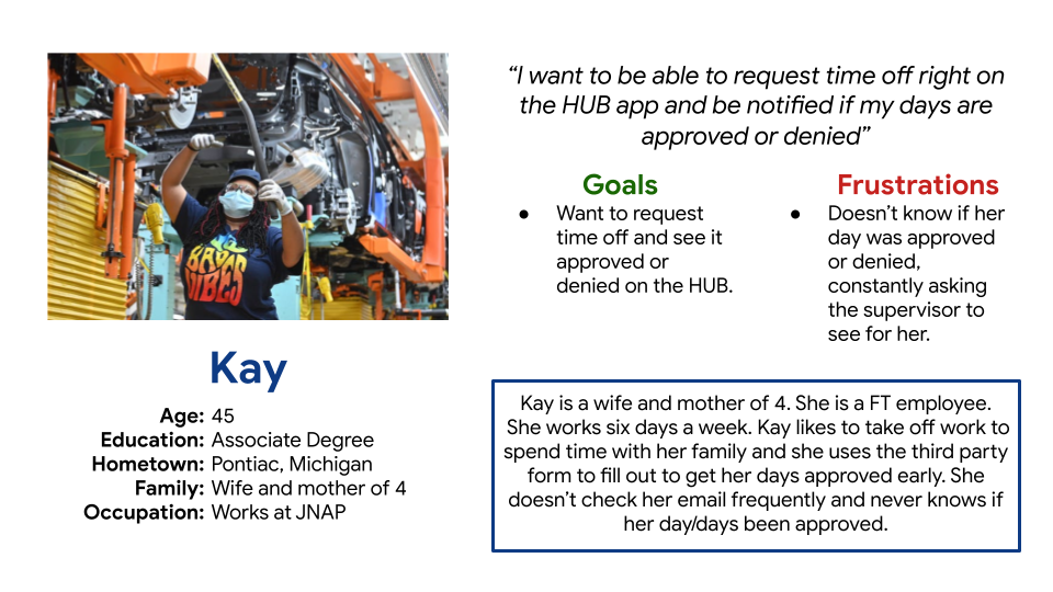
PROBLEM STATEMENT
• User Persona: Kay
• Occupation: Employee at Stellantis
• Challenges: Struggles with tracking time off requests and is often unsure if they have been approved or denied.
• Desired Solution: Seeks a mobile app that provides real-time notifications and updates on the status of her time off requests, ensuring convenience and efficiency.
STARTING THE DESIGN
DIGITAL WIREFRAMES
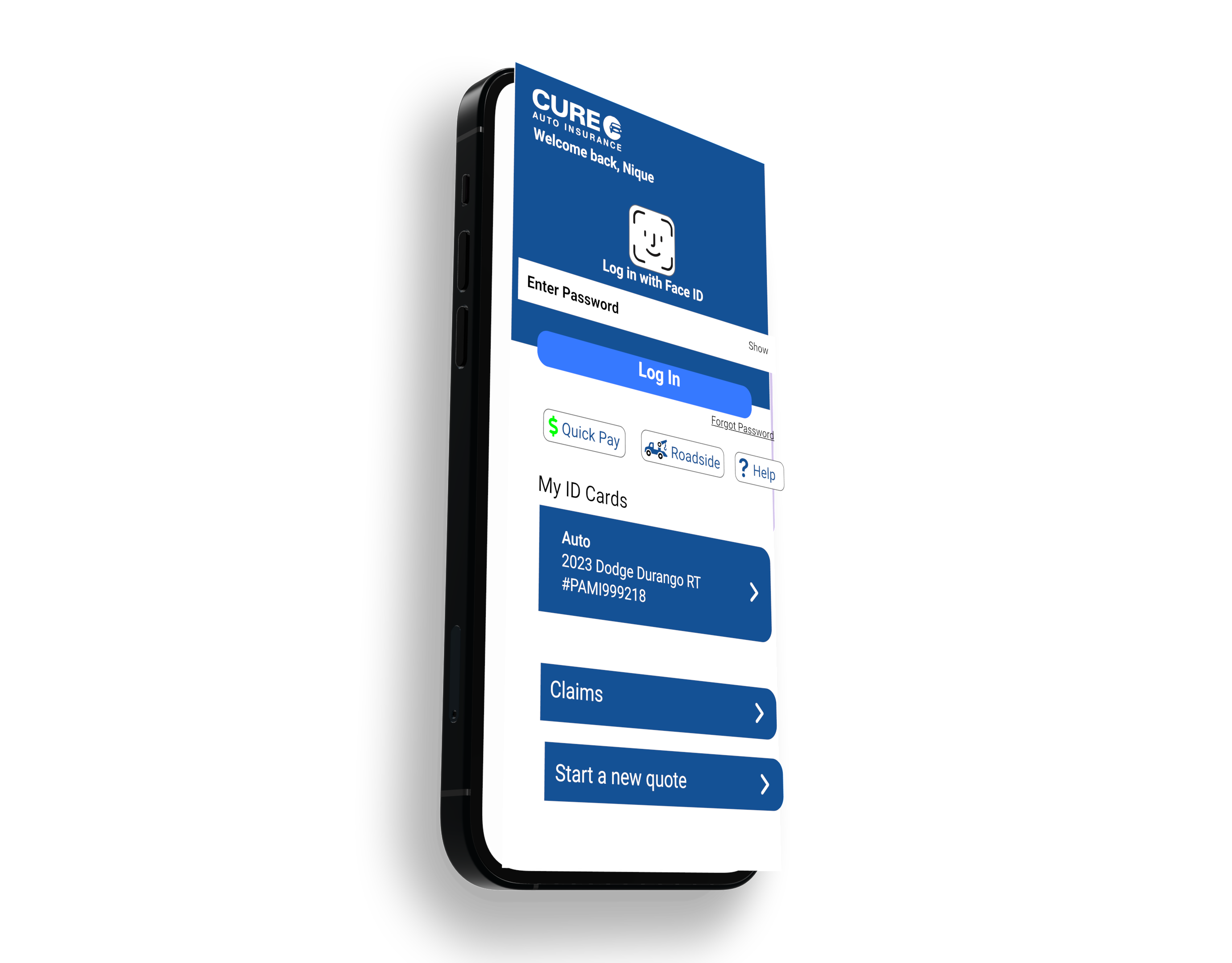
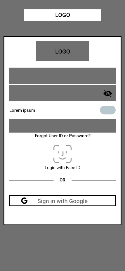
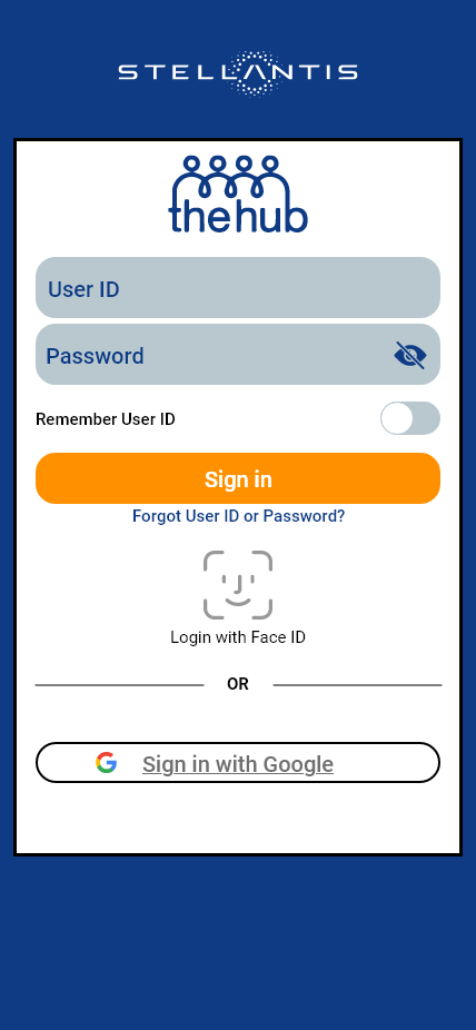
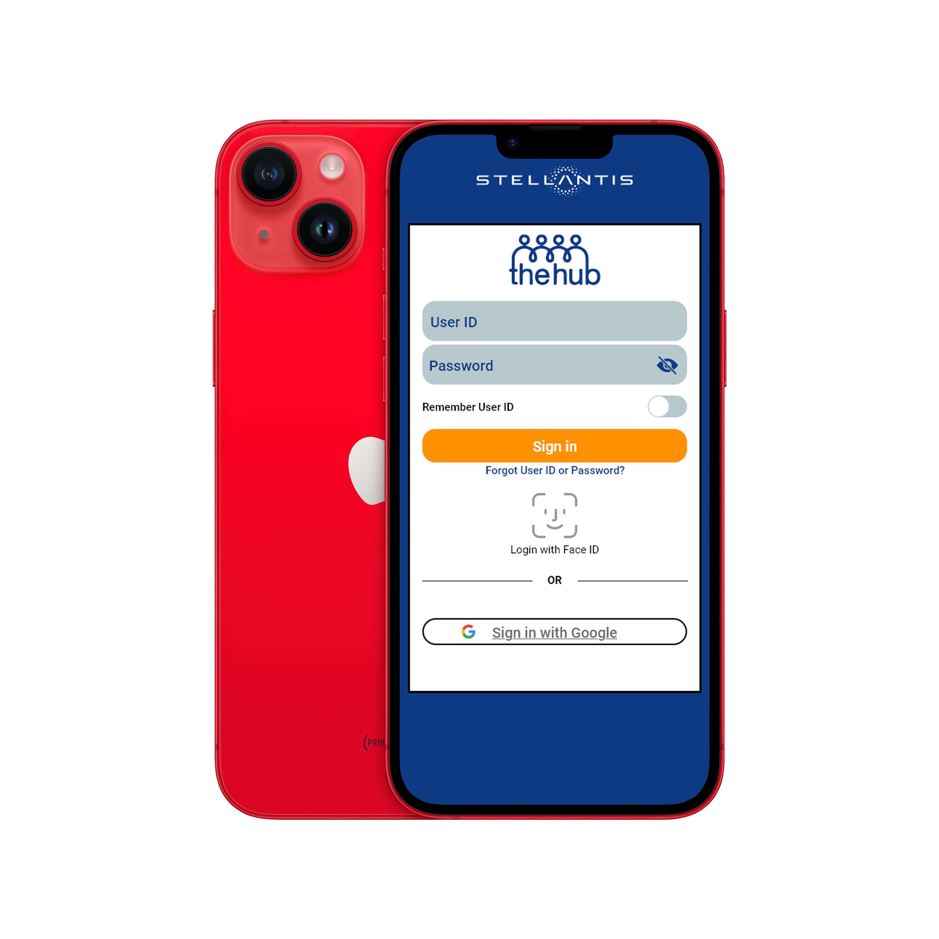
A simple login screen would make it easier for the user to log in only one time. Different options to sign into the app using either TID and password, face ID, or Google sign-in.

DIGITAL WIREFRAMES
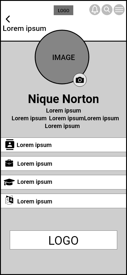
My goal was to create a designated profile screen where users could change and update their information as needed, as you would on the desktop version.

LO-FIDELITY PROTOTYPE
Lo-fi prototype showing the user flow between each screen.

REFINING THE DESIGN
WIREFRAMES
Lo-fi screens to hi-fi screens.

MOCKUPS

Homepage
Login
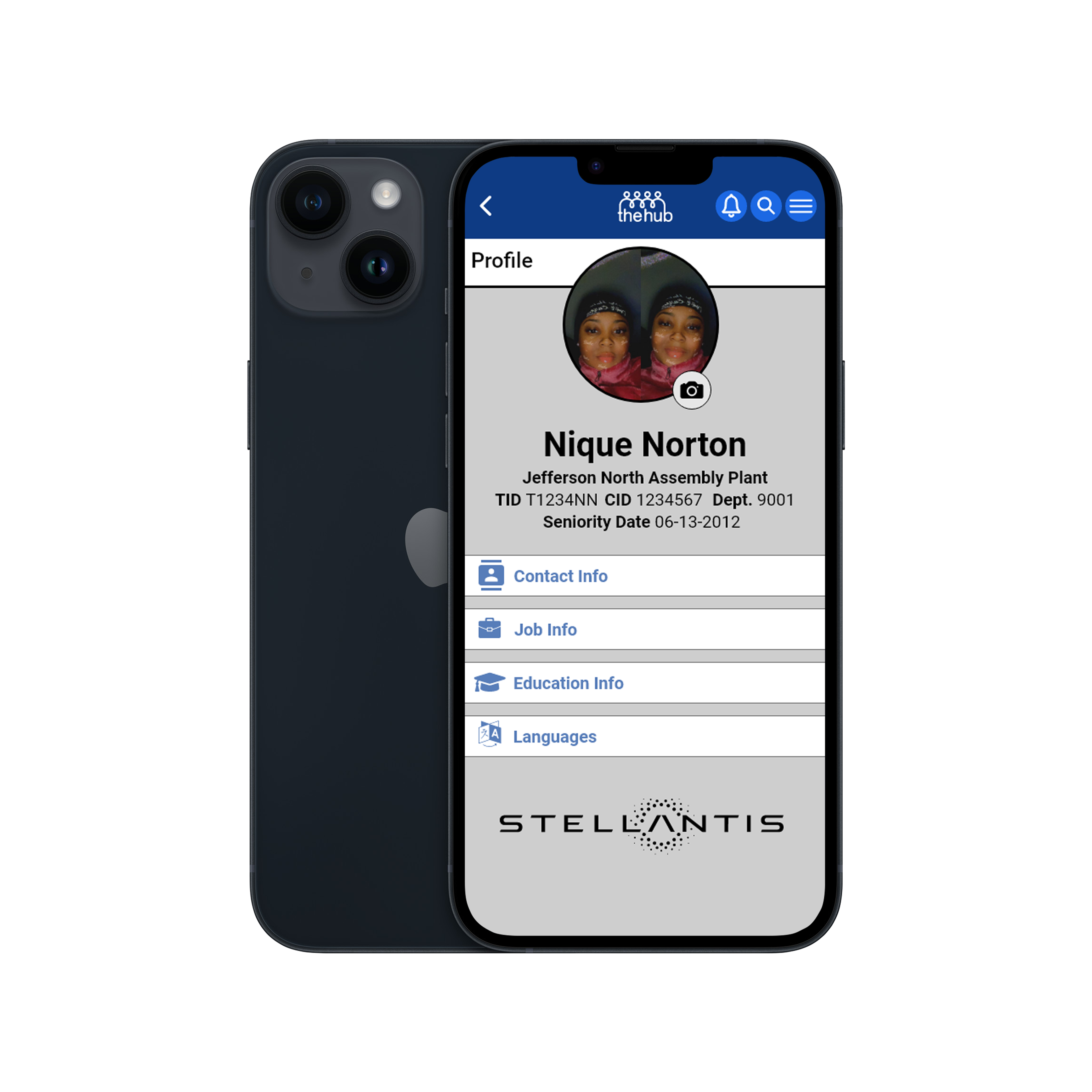
Profile

HI-FIDELITY PROTOTYPE
The hi-fi prototype shows the visual feel and flow of the app.

INTERACTIVE PROTOTYPE
GOING FORWARD
IMPACT
- Improved access to attendance, hours, and pay statements for employees.
- Increased efficiency in requesting time off and receiving notifications.
- Enhanced user experience through a streamlined and intuitive interface.
WHAT I LEARNED
- Importance of gathering and understanding user needs and pain points through research.
- Benefits of designing for accessibility and inclusiveness.
- Significance of ongoing user testing and feedback to continuously improve the design.
- The value of clear and effective communication between stakeholders and the design team.
NEXT STEPS
STEP 1
Conduct thorough user testing to gather feedback on the app and make any necessary adjustments to the design or functionality.
STEP 2
Consider integrating the app with other systems used by the company to improve efficiency and reduce manual data entry.
STEP 3
Establish clear communication channels to ensure employees are informed about the app and any updates or changes.
STEP 4
Promote the app to employees and encourage adoption by highlighting the benefits and how it can simplify their workday.
JNAP est. 2012 🏭