
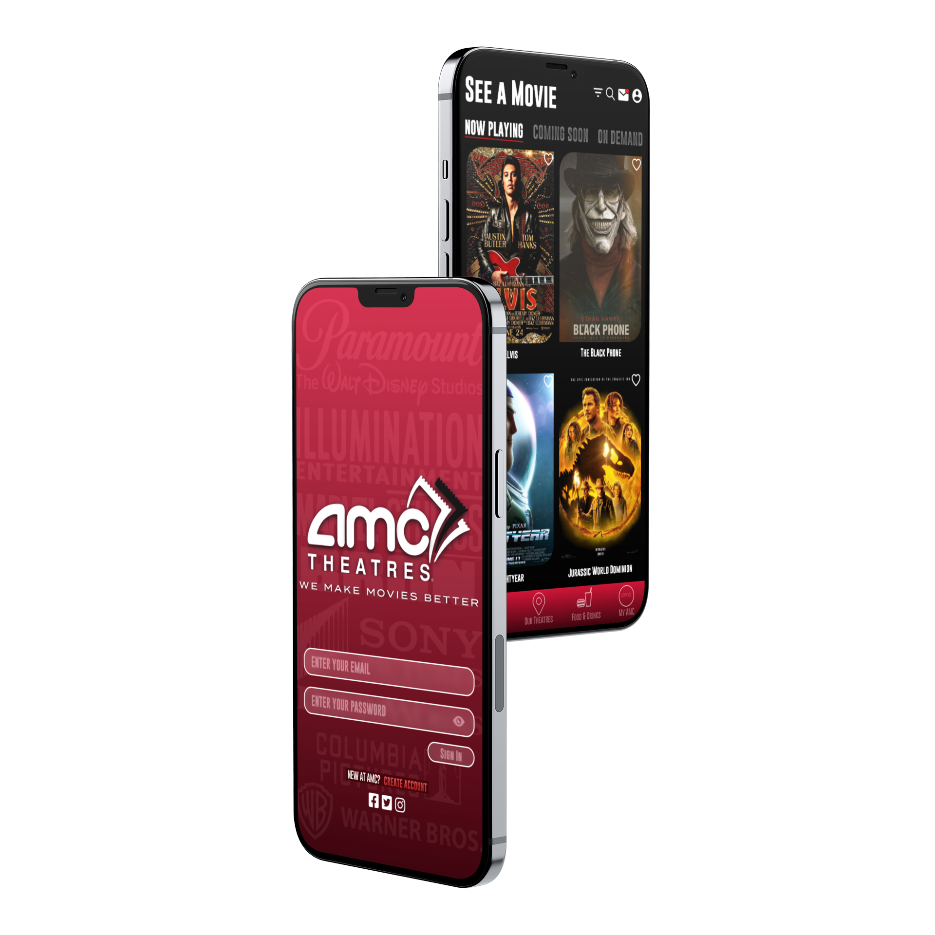
OVERVIEW
• The AMC Theatres mobile app redesign focused on enhancing the user experience and boosting brand engagement.
• Extensive user behavior research and industry best practices informed the design direction.
• The new app features an intuitive interface for easy navigation and purchasing, including a movie preference feature.
• With a clean, modern aesthetic, the redesign prioritized simplicity and ease of use.
• The redesign showcases the importance of user research, customer-centric design, and investment in development, delivering a seamless and enjoyable moviegoing experience.
ROLE
UX/UI Designer
• Conducted user research and developed design solutions.
• Created wireframes, prototypes, and interactions.
• Focused on visual design and testing to ensure usability and a smooth user experience.
Programs used:
Illustrator, Photoshop, XD
THE PROBLEM
• The previous AMC Theatres app was not user-friendly.
• It lacked essential functionality, hindering the overall experience.
• The app did not provide a seamless experience for users, leading to frustration and difficulty in completing tasks like viewing movies, purchasing tickets, and accessing menu options.
THE GOAL
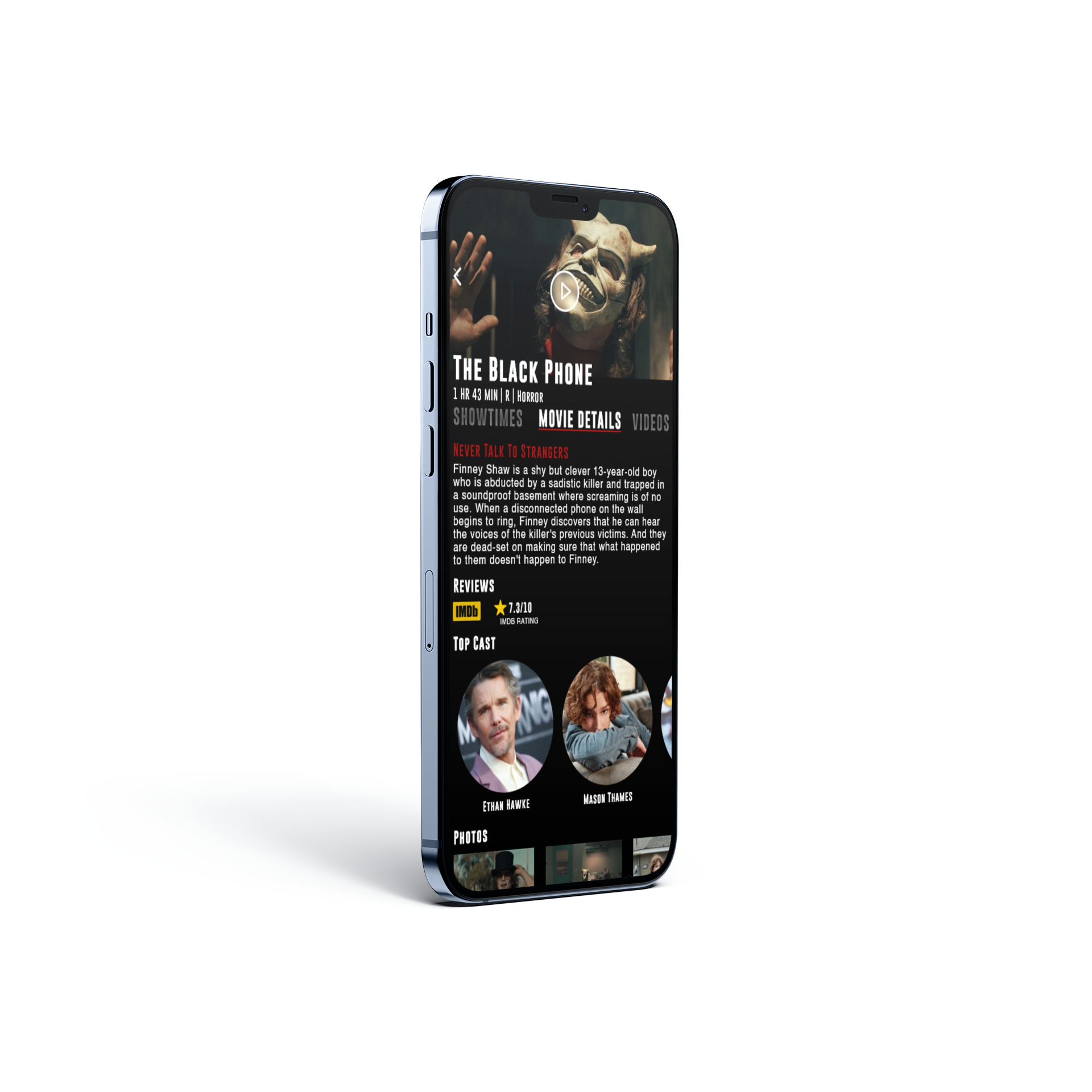
• Improved User Experience: Make it easier for customers to find and view upcoming movies in order of their release date, view the menu, make in-app purchases, and access rewards and promotions.
• Visually Appealing & Intuitive: Redesign the app to be more visually appealing and intuitive, improving overall navigation and ease of use.
• Enhanced Features: Introduce new features that enhance the user experience, such as personalized recommendations and smoother ticket-booking.
• Increased Customer Satisfaction: Improve the app’s functionality and design to increase customer satisfaction and encourage more frequent use.
• Ultimate Goal: Create a mobile app that effectively serves the needs of AMC Theatres customers, making it the go-to platform for movie-going experiences.
USER RESEARCH
SUMMARY:
Research Objective: The user research for the AMC Theatres app redesign aimed to identify pain points and challenges users face when navigating and using the app. Methods like user testing and interviews were used to gather insights on user needs and preferences.
Key Findings:
• Difficulty navigating the app and finding desired information.
• Frustrations with the ticket-booking process.
• A need for more personalized recommendations and an improved menu section.
Redesign Goal: The redesign aimed to create an intuitive, user-friendly, and personalized app that would enhance the movie-going experience. The goal was to address user pain points and offer a customized experience that would encourage users to return to AMC Theatres.
PAIN POINT 1
The unintuitive design confuses users.
PAIN POINT 2
User frustration with navigating the app and viewing the menu.
PAIN POINT 3
Inconsistent and outdated user experience across different devices.
PAIN POINT 4
The inability of the user to sign in instantly to be able to collect rewards for movie ticket purchases.
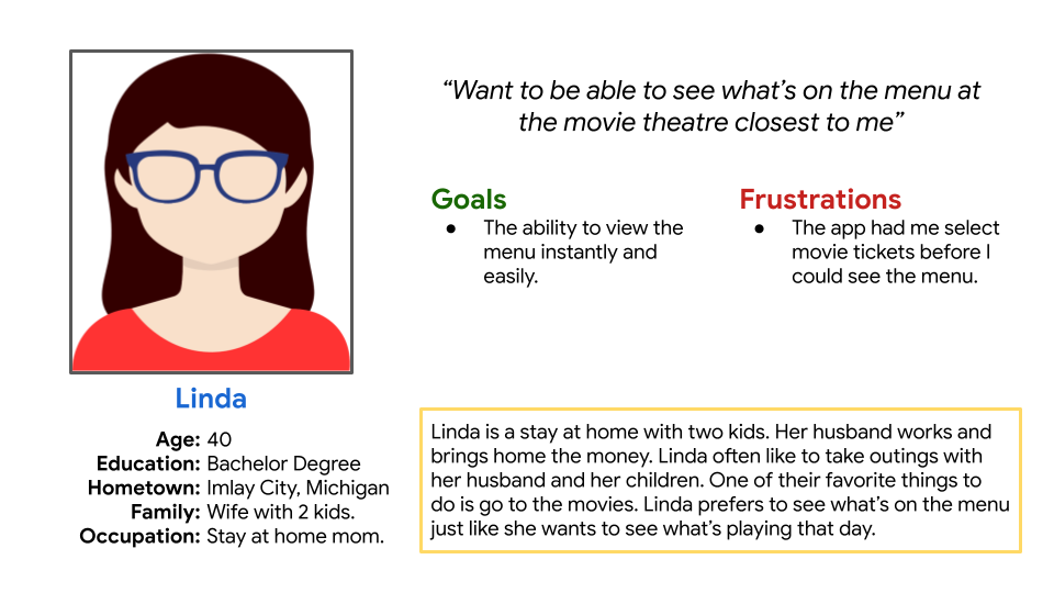
PERSONAS:
THE PROBLEM STATEMENT
• User: Linda, a busy wife, mom of two kids, and avid movie-goer.
• Problem: Linda struggles to navigate the AMC Theatre app, especially when trying to view menus and make food and beverage selections.
• Challenges:
• Confusing app design and unorganized menu options.
• Frequently misses out on food and beverage offerings.
• Spends valuable time searching for what she wants, leading to frustration.
• Impact: The frustration with the app results in a negative user experience, diminishing her overall satisfaction with AMC Theatre visits.
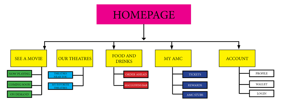
STARTING THE DESIGN
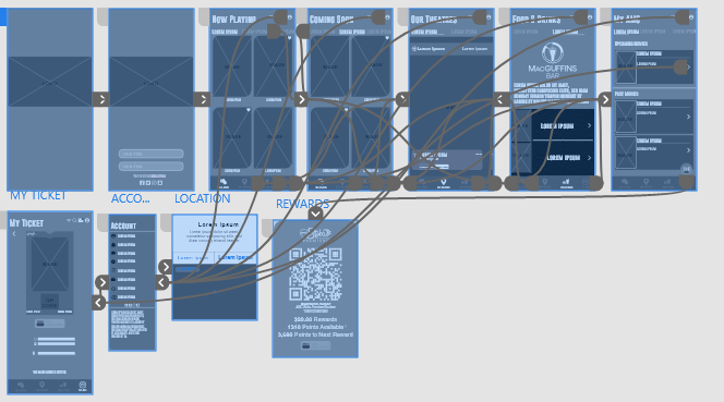
SITEMAP
Clear overview of the app's structure and to help inform the redesign process.
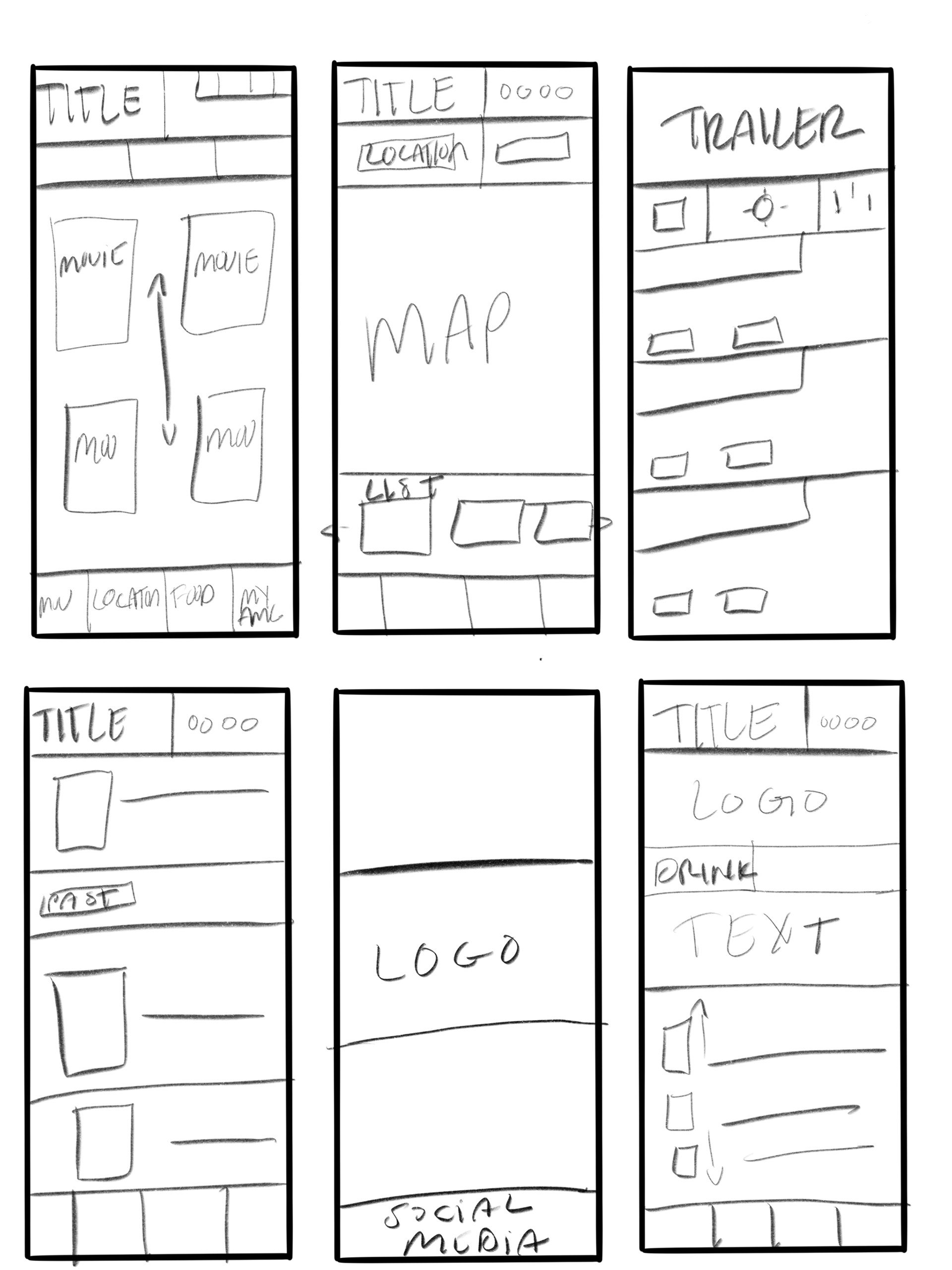
ROUGH PAPER WIREFRAMES
I wanted to keep the same layout as the original app but make it more functional. Much-needed space and tried to brand it throughout.
DIGITAL WIREFRAMES
My goal here is to add a better visual look and feel. The space gives it more air instead of looking tight on such a small screen.

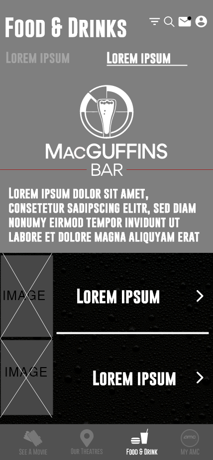
DIGITAL WIREFRAMES
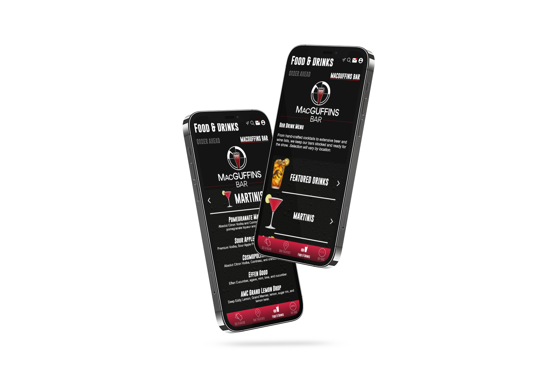
A designated menu that the original app lacks. Something you'll be able to pull up and instantly see before arriving at the movies.
LO-FIDELITY PROTOTYPE
Lo-fi prototype showing the user how the flow of the app will go.
USABILITY STUDIES: FINDINGS
ROUND 1 FINDINGS
1. Users want to be able to see the menu.
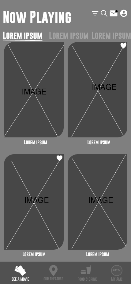
2. User wanted the movies to be in order.
3. User wanted location enabled on the menu.
ROUND 2 FINDINGS
1. The menu had too many unnecessary steps.
2. The cramped feel of the app was distracting.
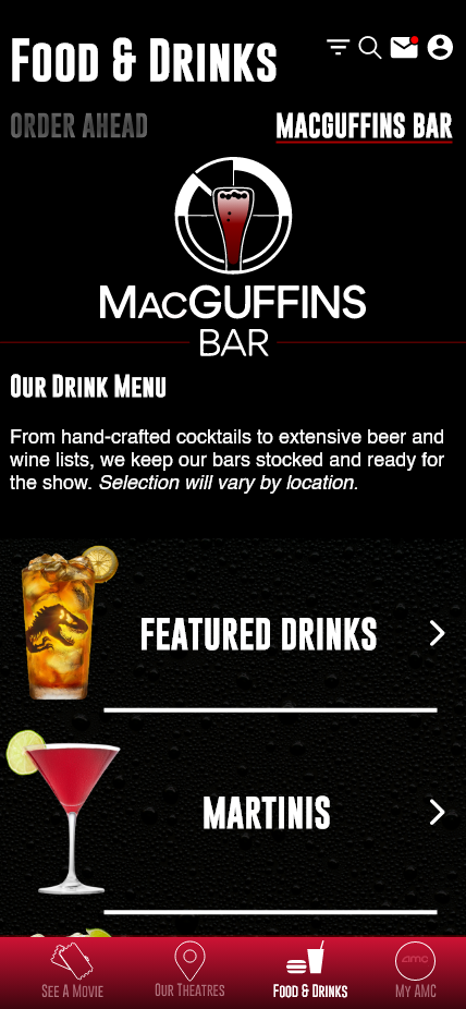
3. User wanted to see a martini menu.
REFINING THE DESIGN
BEFORE USABILITY TESTING

AFTER USABILITY TESTING

BEFORE USABILITY TESTING
AFTER USABILITY TESTING
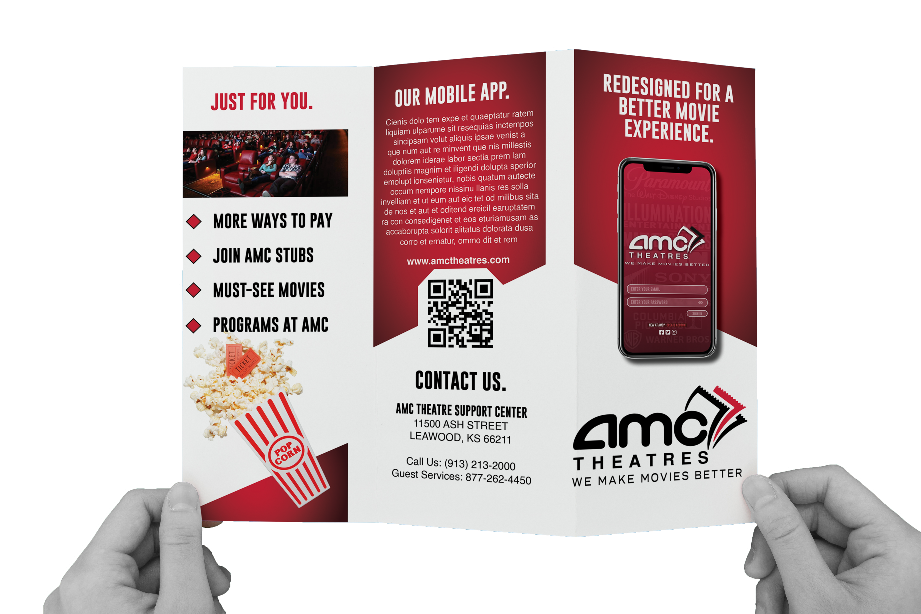
MOCKUPS + BROCHURE
HI-FIDELITY PROTOTYPE
The hi-fi prototype shows the visual feel and flow of the app.

INTERACTIVE PROTOTYPE
ACCESSIBILITY CONSIDERATIONS
ROUND 1 FINDINGS
1. Used icons for better navigation.
2. Provided alt text to the movie details section for the visually impaired.
3. Added wheelchair seating to the seating chart for users with wheelchairs.
GOING FORWARD
TAKEAWAYS
IMPACT
• Improved User Experience: One of the main goals was to make it easier for users to access the information they need. This can be measured by surveying users after the redesign to gauge satisfaction and determine if the goals were met.
• Higher User Engagement: The redesigned app should lead to increased engagement and usage. This can be tracked by monitoring:
• Daily active users
• Time spent using the app
• Number of repeat visits
• Increased Sales: The redesign should make purchasing tickets and accessing showtime information easier, leading to higher sales. This can be tracked by measuring:
• Number of ticket sales
• Revenue generated
• User Feedback: A suggestion was made by a user: "I'd love to see a martini menu on the app!" This kind of user feedback can help guide future improvements or additional features.
WHAT I LEARNED
• Importance of User Research: This case study highlighted the significance of user research in design. By conducting research, I gained a better understanding of users' pain points and needs, enabling me to make informed decisions and ensure the redesign met their expectations.
• Impact of the Redesign: The AMC Theatres app redesign led to:
• Increased user satisfaction
• Improved user engagement
• Higher sales
• Conclusion: The successful redesign not only addressed user needs but also contributed to measurable improvements in app performance and business outcomes.
NEXT STEPS
STEP 1
Refining the design based on user feedback and testing results.
STEP 2
Developing and implementing the redesigned app, with a focus on user-centered design and accessibility.
STEP 3
Continuously monitor and analyze the app's usage and performance to identify areas for improvement and make necessary updates.
STEP 4
Conducting additional user research to ensure that the app continues to meet the needs of AMC Theaters customers.
STEP 5
Keeping up with industry trends and best practices to stay ahead in the ever-evolving world of mobile app design.
STEP 6
Implementing features that enhance the app's overall experience, such as integrating loyalty programs and adding personalized recommendations.
We Make Movies Better 🎬