
OVERVIEW
Title: The Scary Hours
Subtitle: Stories To Keep You Up All Night
Genre: Horror / Supernatural Anthology
Target Audience:
Age Group: Teens and Young Adults (15-30)
Genders: All
Interests: Horror, supernatural stories, thrillers, psychological suspense, nostalgic books like Goosebumps
Concept: A collection of spine-chilling short stories exploring fear—haunted locations, mysterious strangers, strange phenomena, and the unknown. Each story unfolds during the "scary hours," where reality and nightmares converge. A mix of suspense, twists, and playful eeriness will keep readers hooked and awake.
Purpose of the Project:
Visual Hierarchy: Explore the use of typography to reflect the eerie, suspenseful theme, guiding the reader’s eye from the title to the body text.
Mood Alignment: Typography is chosen to evoke fear, suspense, and curiosity, reinforcing the book's haunting tone.
Readability: Balance stylistic expression with readability, ensuring a smooth flow across the design while maintaining a spooky atmosphere.
Programs used:
Illustrator, InDesign, Photoshop

THE ROUGH DRAFTS
First Version:
Design Elements:
• Imagery: Grayscale vintage alarm clock surrounded by swirling smoke, symbolizing the eerie concept of "scary hours" where time and fear collide.
• Typography: NightScary font for the title, evoking a jagged, unsettling feel; Futura for the subtitle and supporting text to ensure readability.
• Aesthetic: Bold and minimalist, using negative space to create a sense of mystery and fear.
Feedback:
• Typography Hierarchy: The author's name (Tales from Nique Norton) was too bold, overshadowing the subtitle. The recommendation was to reduce the weight of the author's name so the subtitle could stand out more.
• Layout: The clock was slightly hidden behind the text, leading to a suggestion to raise the image to make the clock more prominent.
Strengths:
• Minimalist, haunting, and clean design with a strong focus on atmosphere.
Challenges:
• The lack of color reduced visual engagement compared to the second version.
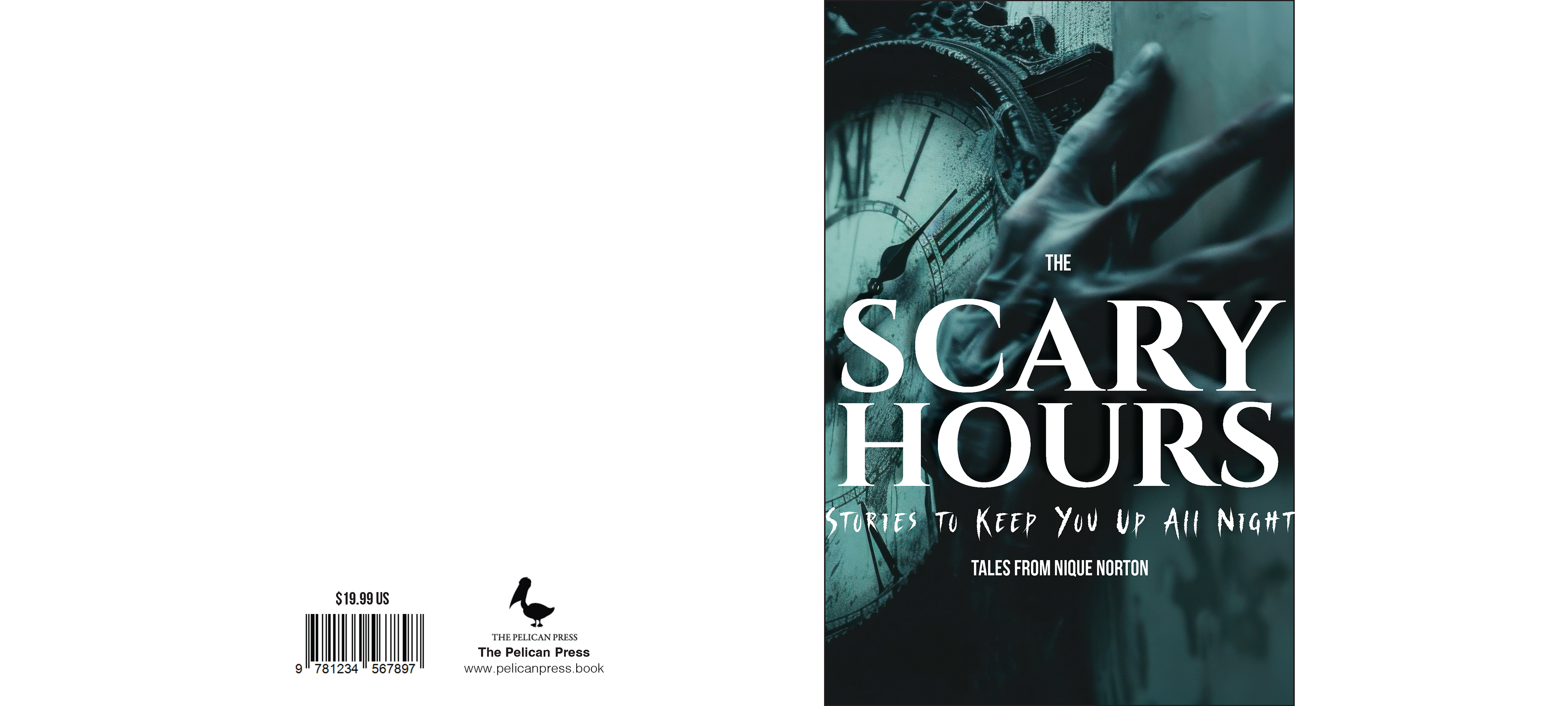
Second Version:
Design Elements:
• Imagery: Dark teal filter for contrast and visual engagement, with a hand reaching toward the clock, adding tension and intrigue while making the imagery more dynamic and symbolic.
• Typography: Cinzel for the title, giving an elegant, refined look that contrasts with the unsettling nature of the subtitle. Bebas Neue Pro and NightScary were used for the subtitle.
Feedback:
• Typography Hierarchy: Similar to Version One, the author's name was too bold, drawing attention away from the subtitle. The recommendation was to reduce the weight of the author's name to improve visual flow.
• Layout: Suggested to lower the text in the design, allowing the imagery to take center stage and stand out more clearly.
Design Strength:
• Stronger color contrast, which made this version more visually engaging than the grayscale design of Version One.
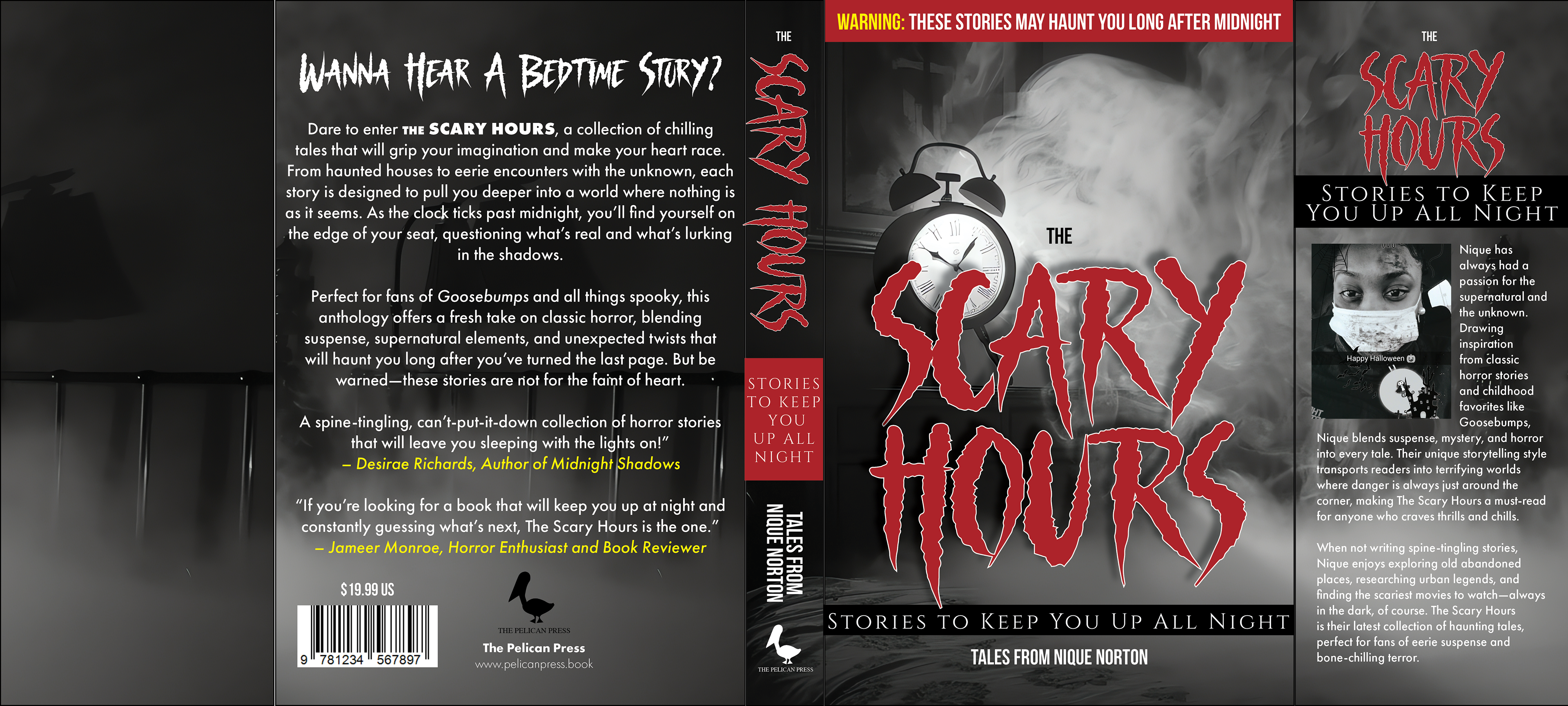
The Final Draft
What Worked:
Typography:
• I used NightScary for the title to keep that creepy feel. However, I made the author’s name too bold, overshadowing the subtitle, which the feedback suggested fixing.
• I used NightScary for the title to keep that creepy feel. However, I made the author’s name too bold, overshadowing the subtitle, which the feedback suggested fixing.
Imagery:
• The clock and smoke stayed central, but as noted in the feedback, the clock could’ve been raised for better visibility.
• The clock and smoke stayed central, but as noted in the feedback, the clock could’ve been raised for better visibility.
Warning Banner:
• The red warning banner worked well, adding urgency and intrigue.
• The red warning banner worked well, adding urgency and intrigue.
Layout:
• I balanced the design but missed the chance to lower the text to give the imagery more room to stand out.
• I balanced the design but missed the chance to lower the text to give the imagery more room to stand out.
Lessons Learned:
• Submitting without checking feedback was a learning moment. I realized I could’ve improved the type hierarchy, text layout, and imagery placement to create a more polished design.
Next Steps:
• Tone down the boldness of the author’s name so the subtitle stands out more.
• Raise the clock image so the text does not hide it.
• Experiment with text placement to give the visuals more room.
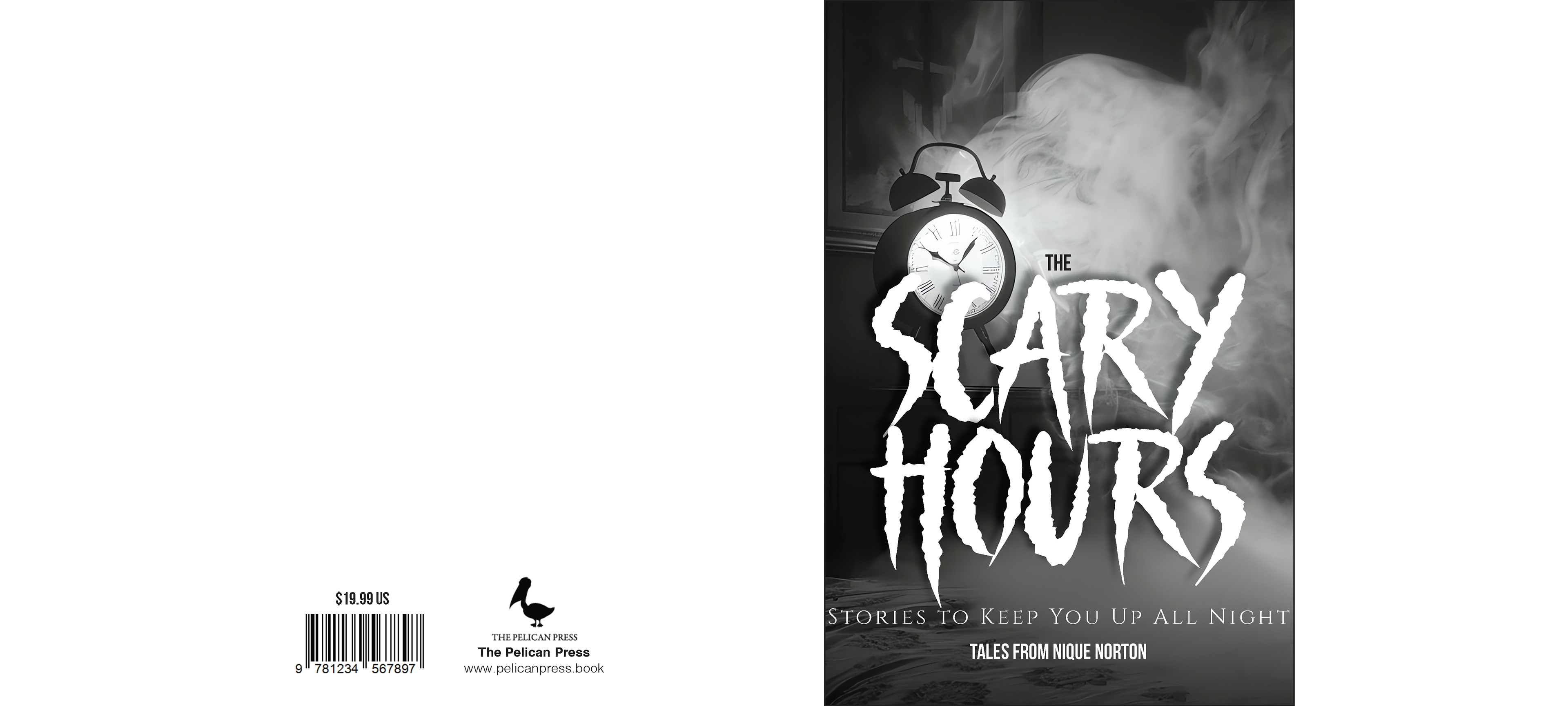
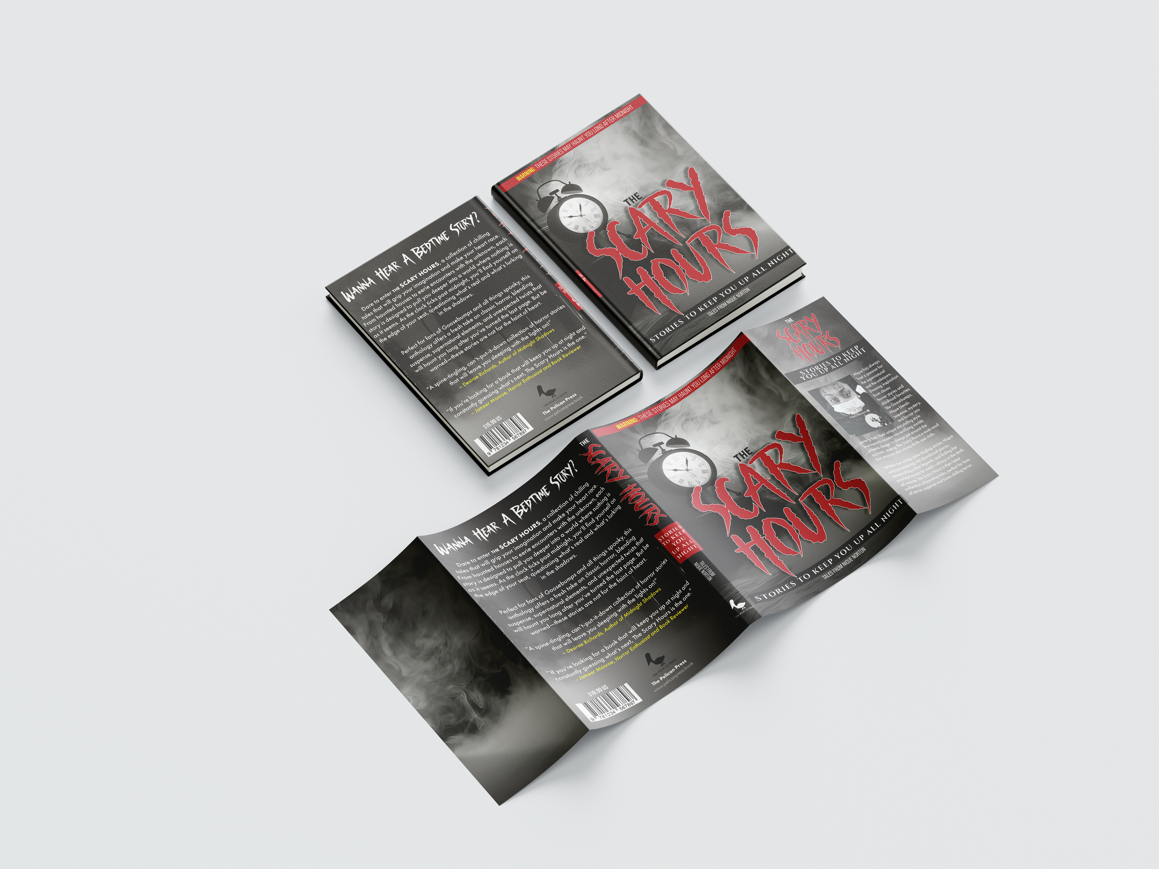
The Final Design
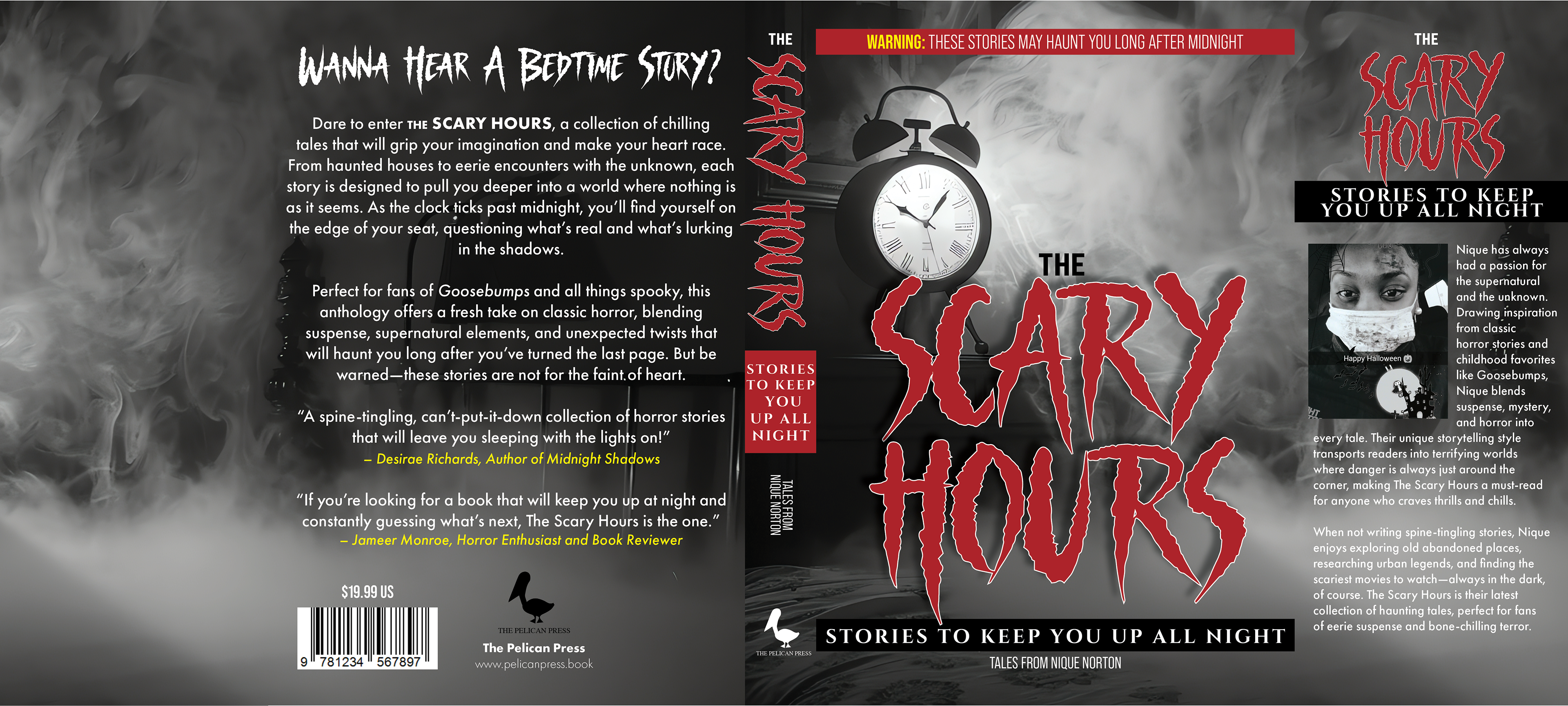
Final Version:
What Changed:
Typography Fix:
• I toned down the author's name so the subtitle—"Stories to Keep You Up All Night"—stands out more, creating better text flow.
• I toned down the author's name so the subtitle—"Stories to Keep You Up All Night"—stands out more, creating better text flow.
Imagery Adjustments:
• I raised the clock so it's no longer hidden by text, making it a more substantial visual focus.
• I raised the clock so it's no longer hidden by text, making it a more substantial visual focus.
Text Placement:
• By shifting the text layout, I gave the imagery more space to shine. The red warning banner adds excitement without being too much.
• By shifting the text layout, I gave the imagery more space to shine. The red warning banner adds excitement without being too much.
Color and Contrast:
• I kept the grayscale theme but added red accents for contrast, making the design pop while keeping it spooky.
• I kept the grayscale theme but added red accents for contrast, making the design pop while keeping it spooky.
Final Thoughts:
• The final design ties everything together. The tweaks to hierarchy, imagery, and layout make the cover more engaging and perfectly set the tone for the chilling stories inside.

Wanna Hear A Bedtime Story? ⏰