
OVERVIEW
• Simplified donation process with intuitive "Donate Now" buttons and smoother navigation
• Revamped volunteer sign-up form for easy access and completion
• Redesigned app navigation for improved user-friendliness, with easy access to sections like "About Us" and quick return to the home page
• Maintained consistent brand identity with Elephaid's colors, logos, and bold elephant imagery
• Enhanced accessibility with better text contrast and functional icons and buttons
• Aimed to increase user engagement and make supporting Elephaid's cause seamless
ROLE
UX/UI Designer.
• Conducted user research to understand user needs and behaviors.
• Created wireframes to outline app structure and functionality.
• Developed prototypes to visualize and test design concepts.
• Focused on interaction design to ensure a seamless user flow.
• Led visual design to create an aesthetically pleasing and functional interface.
• Conducted user testing to gather feedback and refine the design for optimal usability.
Programs used:
Illustrator, Photoshop, XD

BACKGROUND
• Organization: Elephaid Foundation, a U.S.-based non-profit focused on protecting elephants from poaching and habitat loss.
• App Purpose: Connects with supporters by sharing educational content, enabling donations, and allowing elephant sponsorships.
• User Engagement: Strong engagement with content, but struggles with securing donations through the app.
• User Research Insight: Identified functionality issues on the Donation page as a barrier to donation completion.
OBJECTIVE
• Improve overall user experience by creating a more intuitive, accessible, and engaging platform.
• Streamline the donation and volunteer sign-up processes for ease of use.
• Enhance app navigation for better usability.
• Improve content readability and accessibility.
• Ensure effective communication of Elephaid's mission through high-quality visuals and clear calls to action.
• Increase user engagement, donation rates, and volunteer involvement.
THE PROBLEM
• Users struggled with critical actions like donating and signing up to volunteer due to the app's initial design.
• Issues included confusing navigation, hard-to-read text, and unclear call-to-action buttons (e.g., "Give").
• These design flaws hindered users' ability to effectively support elephant conservation efforts.
• Resulted in a lower rate of donations and volunteer engagement, with users often getting stuck or abandoning the process.
THE GOAL
• Streamline and simplify the user experience for quick and intuitive donations and volunteer sign-ups.
• Improve navigation and enhance readability.
• Introduce clear and prominent "Donate Now" and "Volunteer" buttons.
• Maintain consistency with Elephaid's branding using bold visuals and messaging to emphasize the mission.
• Increase engagement and support for elephant conservation efforts.
USER RESEARCH
• Identified issues with confusing navigation, unclear donation and volunteer sign-up processes, and poor accessibility (e.g., low text contrast, unclear icons).
• Users struggled to complete tasks, leading to frustration and disengagement.
• The redesign aims to simplify navigation, clarify call-to-action buttons, and enhance accessibility for a more seamless and engaging user experience.
• The goal is to better align the app with Elephaid's mission and improve overall user satisfaction.
PAIN POINTS
PAIN POINT 1
Confusing navigation: Users struggled to find essential pages like the donation and volunteer sections, leading to frustration and abandonment.
PAIN POINT 2
Unclear call-to-action buttons: The "Give" button was confusing, causing users to hesitate or not complete the donation process.
PAIN POINT 3
Accessibility issues: Low text contrast and unclear icons made it difficult for users with accessibility needs to navigate and use the app effectively.
PAIN POINT 4
Cumbersome volunteer sign-up: The volunteer form was challenging to find and fill out, leading to errors and incomplete submissions.
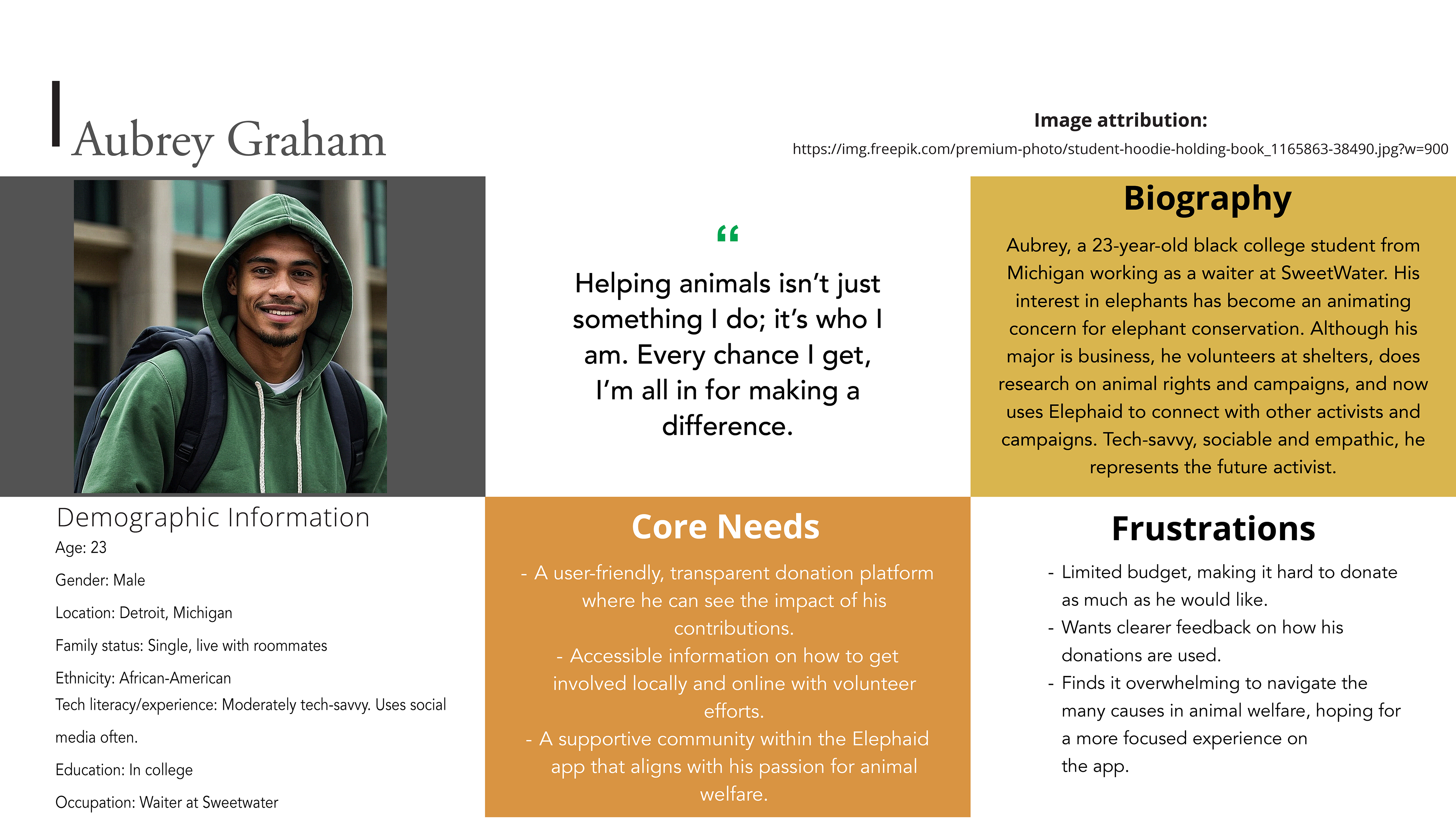
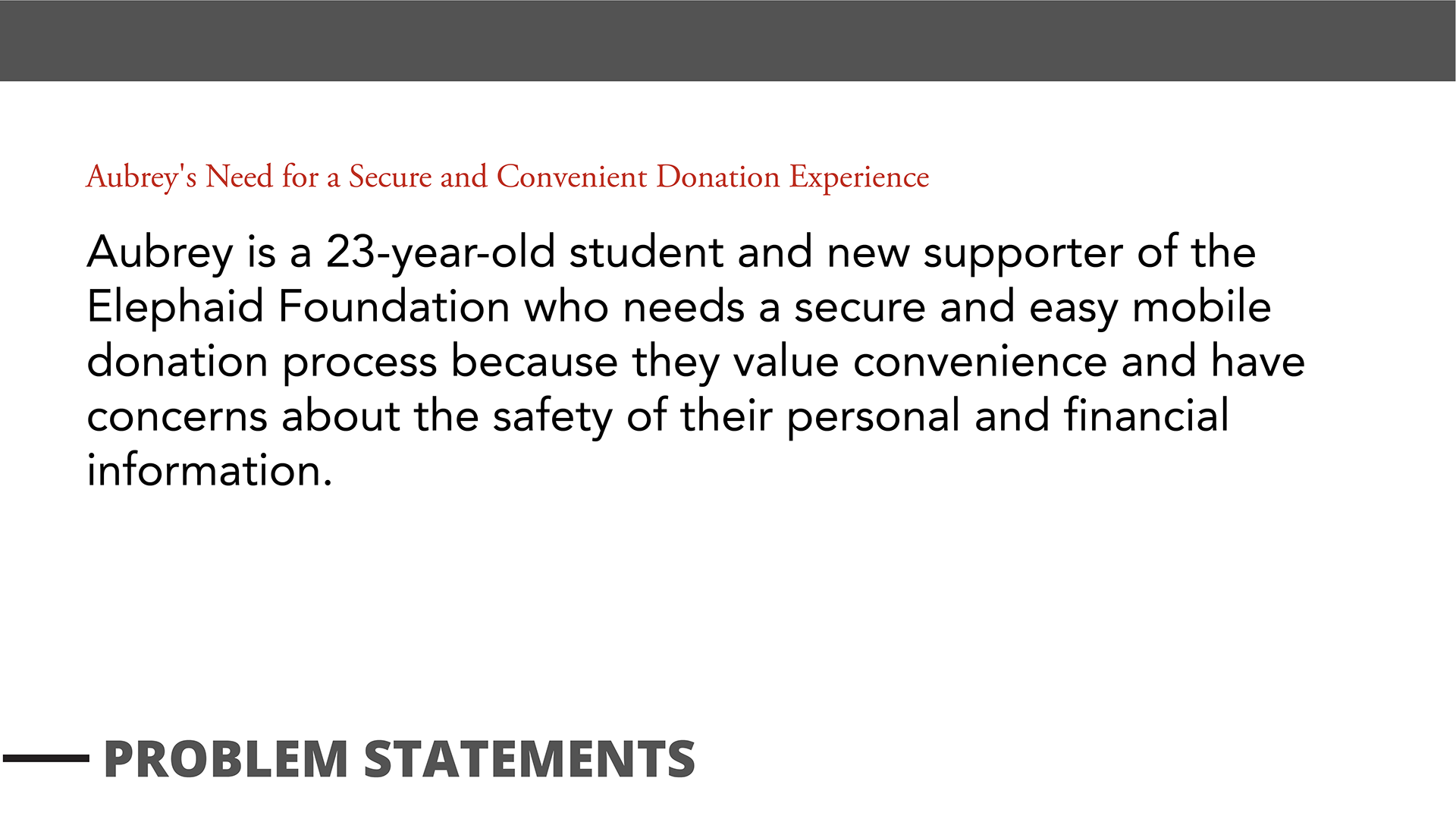
PERSONAS
ORIGINAL DESIGN
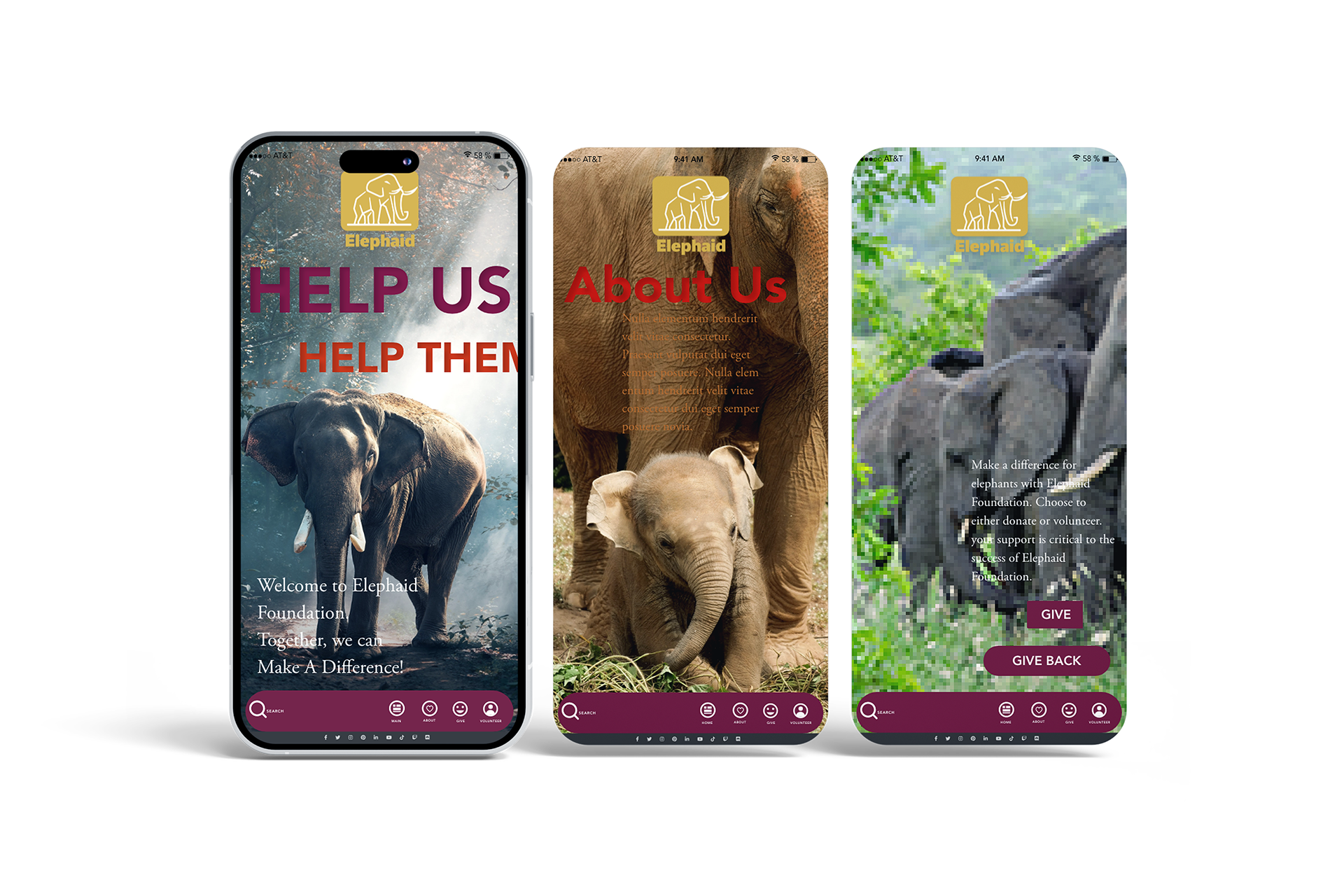
Several critical issues in the original design of the Elephaid app prompted the need for a redesign. One major issue was the low-quality images used throughout the app. These images lacked sharpness and clarity, detracting from the overall professionalism of the design and failing to engage users effectively.
• Unclear Call-to-Action Buttons: The buttons such as "Give" and "Give Back" were vague, which could lead to confusion regarding their specific purpose. The lack of clarity could prevent users from quickly taking action to donate or volunteer.
• Inconsistent Readability: The text, particularly on the "About Us" screen, was difficult to read due to its color blending with the background images. This impacted users' ability to understand Elephaid's mission and navigate the app effectively.
• Complex Navigation: While the app had a visually structured menu at the bottom, the overall navigation seemed cluttered, making it harder for users to intuitively navigate critical sections, like donating or learning about volunteering opportunities.
• Low-Quality Images: The original app featured low-resolution images that didn't visually captivate users or effectively communicate Elephaid's mission. These low-quality visuals made the app feel less polished and professional.
Overall, while the original design effectively utilized elephant imagery to engage users emotionally, it lacked usability features, such as straightforward navigation and easily readable text, leading to a suboptimal user experience.
STARTING THE DESIGN
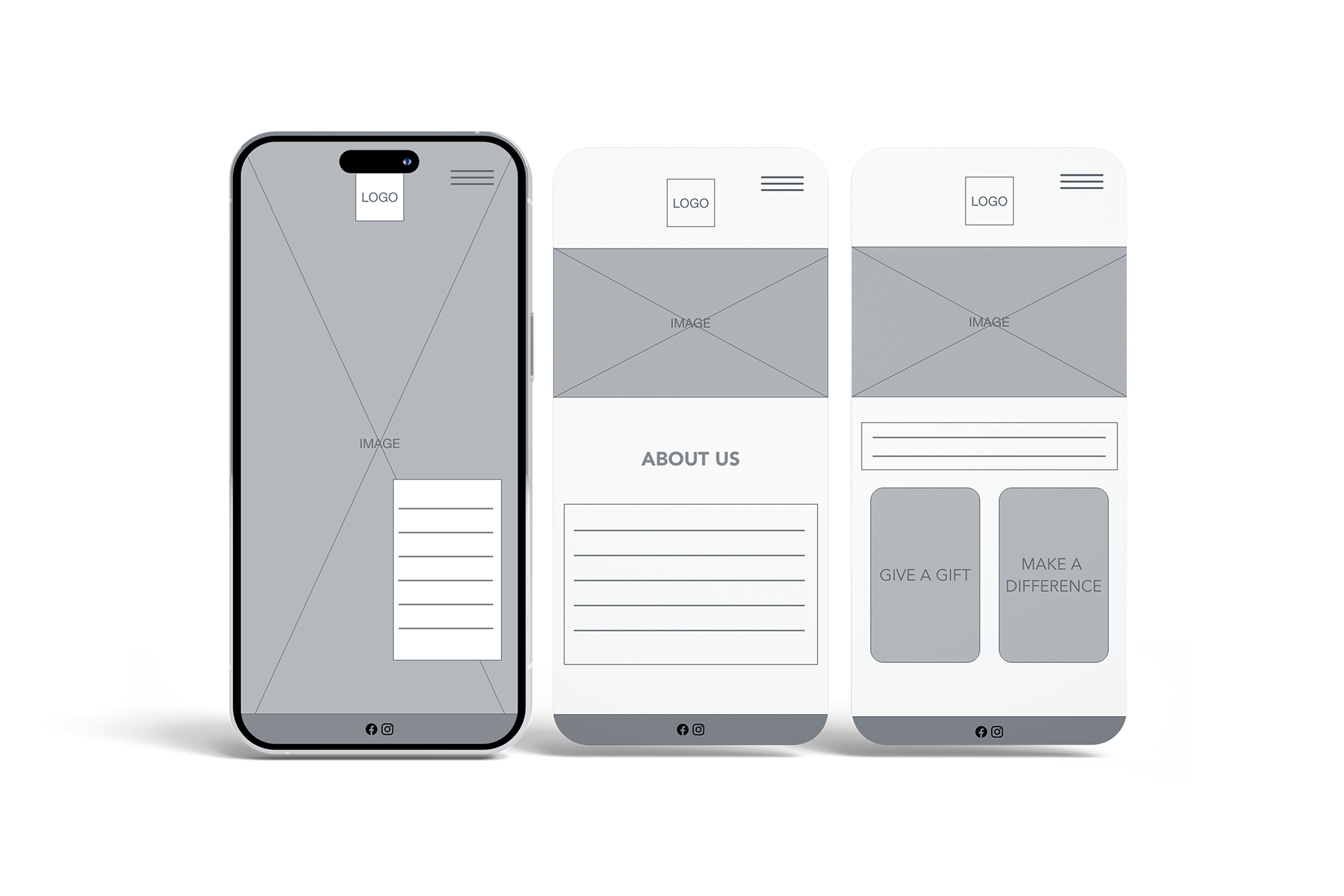
The lo-fi wireframe of the redesigned Elephaid app focuses on creating a clean, streamlined layout for better user experience and functionality. The design emphasizes straightforward navigation with minimal distractions, ensuring that users can quickly find essential information and take action.
• Simplified Visuals: The wireframe features a clean layout with large image placeholders and concise text sections. This helps users quickly identify the content without feeling overwhelmed, allowing for a more intuitive experience.
• Improved Call-to-Action Buttons: Prominent buttons like "Give a Gift" and "Make a Difference" are replaced clearly in the lower half of the screen. This ensures that users immediately understand their options and are encouraged to engage with the app through donations or volunteering.
• Improved Call-to-Action Buttons: Prominent buttons like "Give a Gift" and "Make a Difference" are replaced clearly in the lower half of the screen. This ensures that users immediately understand their options and are encouraged to engage with the app through donations or volunteering.
• Consistent Branding and Structure: The logo is prominently placed at the top across all screens, maintaining brand consistency. The layout follows a simple hierarchy, making navigation between sections (such as "About Us") more intuitive.
Overall, this wireframe highlights a user-centric approach by simplifying the design, making the navigation straightforward, and ensuring that the call-to-action buttons are prominent and clear so users can quickly take action.
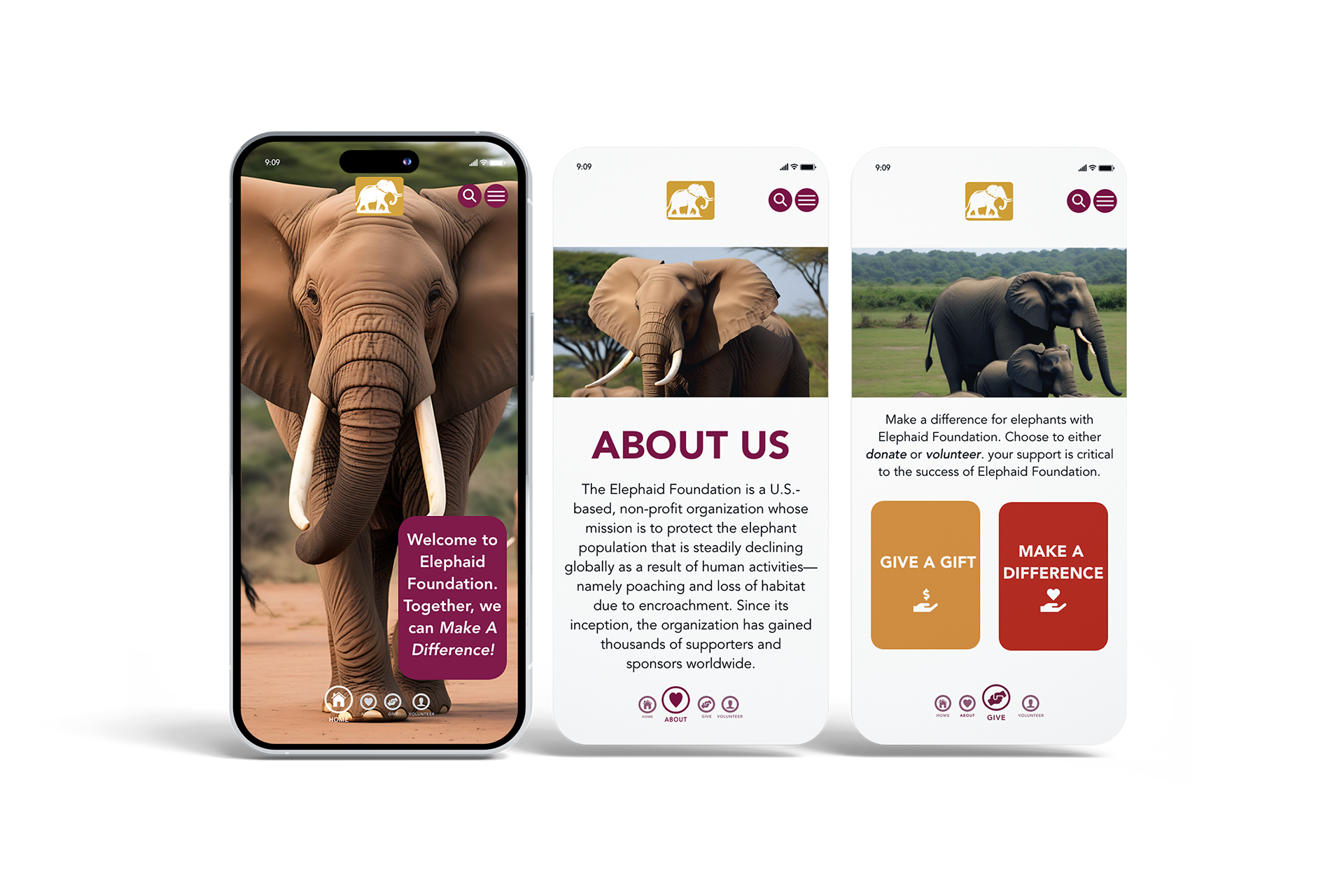
REFINING THE DESIGN
The high-fidelity mockup of the redesigned Elephaid app showcases a much more polished, engaging, and user-friendly interface. The design prioritizes aesthetics and functionality, ensuring that users are immediately drawn into the cause while quickly navigating the app.
• Striking Imagery and Consistent Branding: The mockup features vivid, full-screen images of elephants, aligning with Elephaid's mission and emotionally connecting users to the cause. The logo is consistently placed at the top of each screen, reinforcing the brand identity throughout the app.
• Clear and Bold Call-to-Action Buttons: The "Give a Gift" and "Make a "Difference" buttons are now larger, prominently placed, and color-coded for easy recognition. This helps users quickly identify the main actions they can take, whether donating or volunteering.
• Improved Readability and Layout: The "About Us" section is clearly defined, with large, readable text and a clean layout highlighting the organization. White space and structured formatting ensure the information is easy to digest, making the overall user experience much smoother.
• Intuitive Navigation: The bottom navigation bar is simple and accessible, with clear icons for Home, About, Donate, and Volunteer. This ensures that users can move between sections with minimal effort, enhancing the app's overall flow and usability.
In summary, the hi-fi mockup successfully combines beautiful visuals with functional improvements, making it easier for users to engage with Elephaid and take meaningful action.
INTERACTIVE PROTOTYPE
TAKEAWAYS
IMPACT
• The redesign significantly improved user engagement and experience by addressing core pain points.
• Issues such as confusing navigation, unclear call-to-action buttons, poor readability, and low-quality imagery were resolved.
• The app became more user-friendly and visually compelling, leading to a more streamlined experience.
• Increased user donations and volunteer sign-ups as a result of the improved design.
• Higher-quality images and a simplified layout better aligned the app with Elephaid's mission, making it easier for users to connect with the cause and take action.
WHAT I LEARNED
• The importance of balancing aesthetics with usability—visual appeal is essential, but ensuring ease of navigation and critical actions is equally crucial.
• Gained insights into how minor design elements, like text contrast and button placement, can significantly affect user behavior and engagement.
• Recognized the value of incorporating user feedback early in the design process to create a final product that meets user needs.
NEXT STEPS
STEP 1
Conduct Further User Testing: Gather user feedback on the redesigned interface to ensure the new features are intuitive and functional.
STEP 2
Optimize for Multiple Platforms: Test and ensure the app works seamlessly across various devices and operating systems, enhancing accessibility and reach.
STEP 3
Develop Personalized Features: Incorporate personalized experiences like progress tracking for donations or volunteer activities to increase user engagement.
STEP 4
Regular Content Updates: Continuously refresh content, including images and messaging, to keep the app engaging and relevant and encourage long-term user support.
Protect The Giants 🐘